The Yes and No feedback buttons at the bottom of each article appear grey by default when readers are not hovering over them. This low-contrast default can make the buttons harder to notice, reducing the likelihood that readers engage with them. You can override the default button colors using a CSS snippet to make them more visible, match your brand colors, or create a clearer visual distinction between the positive and negative feedback options.
When to use this
Use this customization when you want to:
- Make feedback buttons more prominent so readers are more likely to interact with them.
- Apply brand colors to the Yes and No buttons to create a consistent visual experience.
- Differentiate the Yes and No buttons with distinct colors, for example, green for Yes and red for No, to reinforce their meaning at a glance.
Before you begin
- You need access to Settings () > Knowledge base site > Site customization > Custom CSS & JavaScript in the Knowledge base portal.
- Have your desired HEX color codes ready before you start. The default snippet uses
#5ebf83(green) for Yes and#e67367(red/orange) for No.
How to change the default feedback button color
-
Navigate to Settings (
) > Knowledge base site > Site customization > Custom CSS & JavaScript in the Knowledge base portal.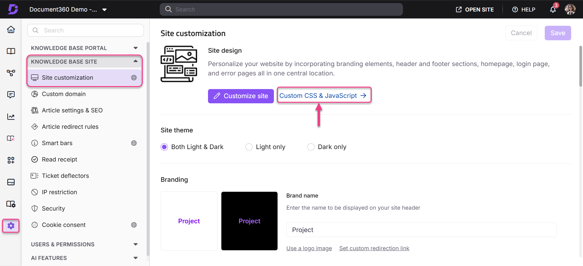
-
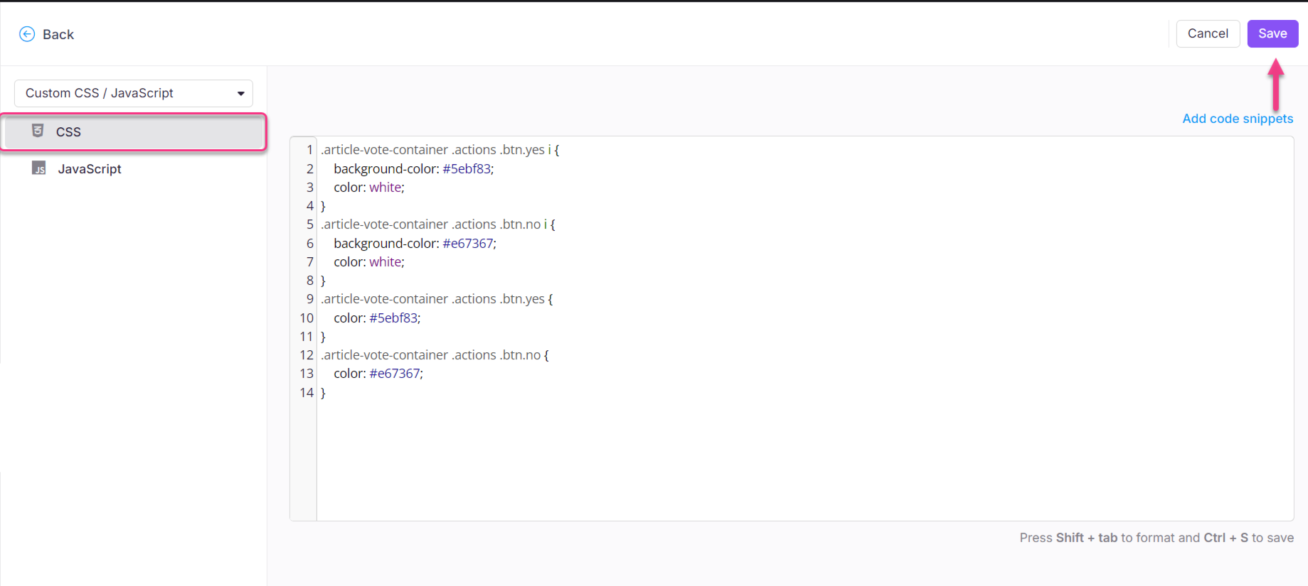
From the left navigation pane, select the CSS tab and paste the following snippet:
.article-feedback-action{
  button[aria-label="Yes"]{
    background-color: #5ebf83;
    color: white;
  }
  button[aria-label="No"]{
    background-color: #e67367;
    color: white;
  }
}
-
Update the color codes to your desired values.
-
Click Save.
Outcome
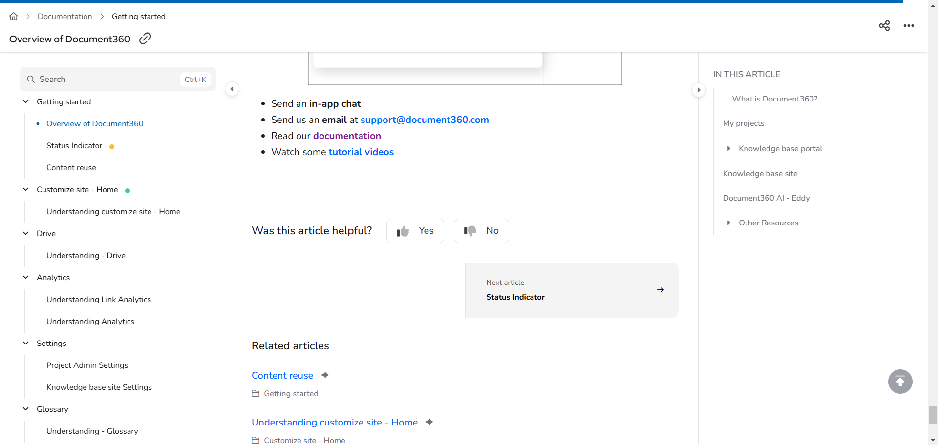
Before
The feedback buttons appear grey when readers are not hovering over them, making them easy to miss.
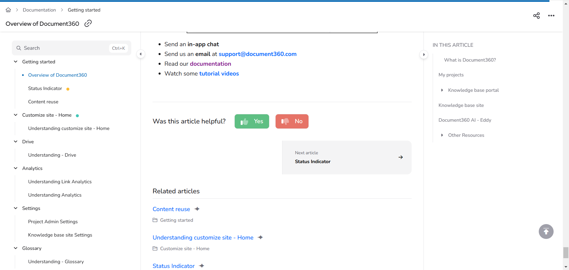
After
After applying the CSS, the feedback buttons display in the specified colors at all times, not just on hover.
Best practices
- Keep Yes and No visually distinct. Readers process color semantics quickly. Using green for Yes and red or orange for No follows established convention and reduces cognitive effort. Avoid using similar colors for both buttons.
- Check contrast against your page background. The button colors you choose should be legible against both Light and Dark mode backgrounds. Use a contrast checker to verify your choices meet WCAG AA standards (minimum 3:1 for UI components).
- Test after saving. Open an article on your knowledge base site and confirm the buttons display in the correct colours in both their default state and on hover.