When your knowledge base is viewed in Dark mode, callout boxes. Info, Error, and Warning can become difficult to read. Their default light-colored backgrounds and text were designed for Light mode, and in Dark mode they may appear washed out, low-contrast, or visually inconsistent with the rest of the page. You can override the Dark mode callout colors using a CSS snippet to ensure callouts remain clear and accessible in both themes.
When to use this
Use this customization when you want to:
- Maintain readability of callout boxes when Dark mode is enabled as the default or available to readers.
- Apply custom brand colors to Info, Error, and Warning callouts specifically in Dark mode without affecting their Light mode appearance.
- Ensure sufficient contrast between callout backgrounds, text, and borders in dark-themed documentation.
Before you begin
- You need access to Settings () > Knowledge base site > Site customization > Custom CSS & JavaScript in the Knowledge base portal.
- This CSS targets Dark mode specifically using the
html[data-bs-theme=dark]selector. It has no effect on callout appearance in Light mode. - Decide on the colors you want for each callout type before you start. The snippet covers three callout types: Info (
.infoBox), Error (.errorBox), and Warning (.warningBox). Each has three customizable properties: background color, text color, and border color.
How to change callout colors in Dark mode
-
Navigate to Settings (
) > Knowledge base site > Site customization > Custom CSS & JavaScript in the Knowledge base portal.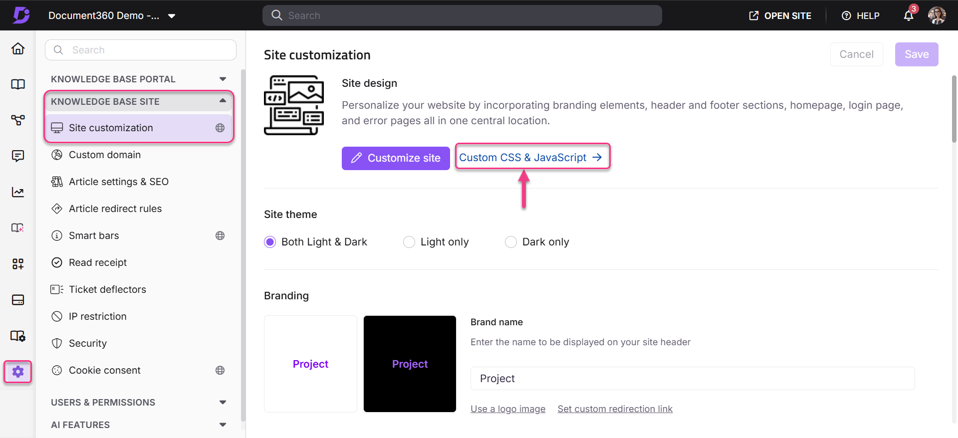
-
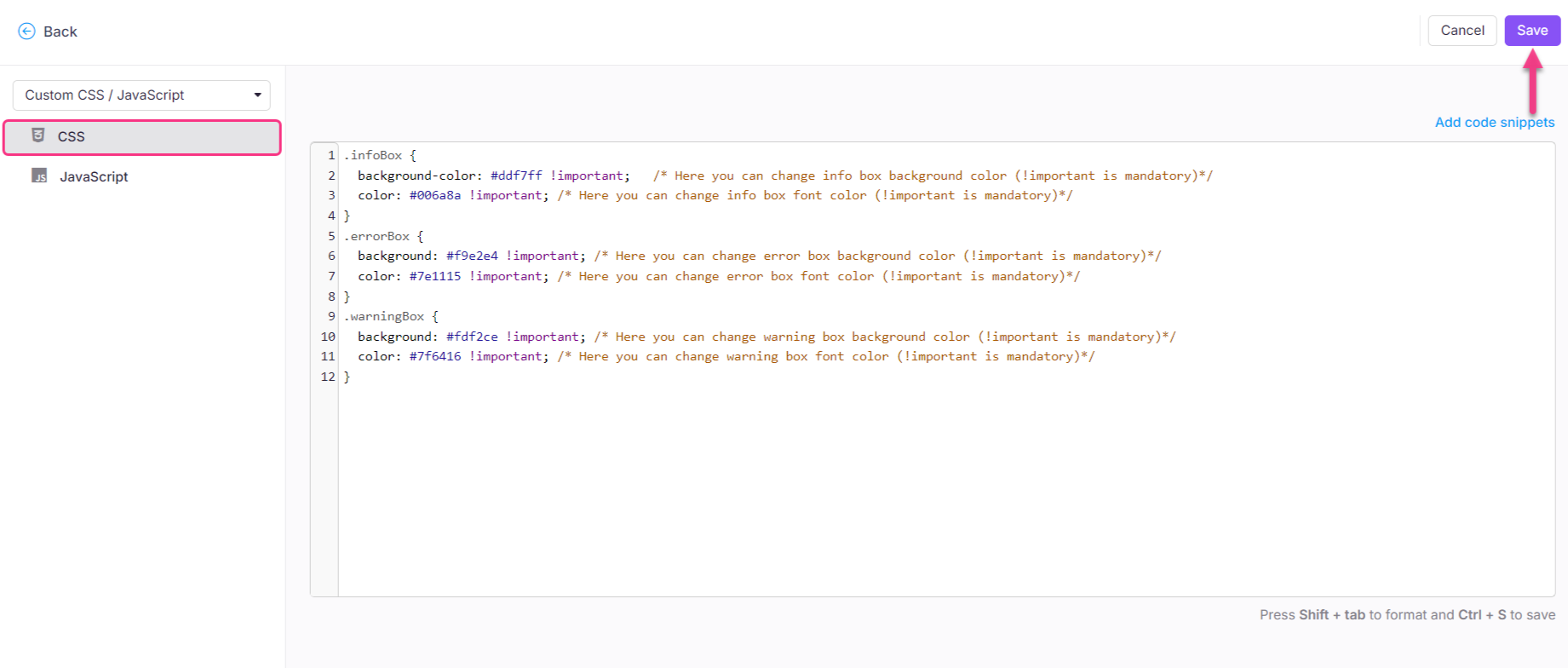
From the left navigation pane, select the CSS tab and paste the following CSS snippet:
html[data-bs-theme=dark] .infoBox {
  background-color: #ddf7ff !important;   /* Here you can change info box background color (!important is mandatory)*/
  color: #006a8a !important; /* Here you can change info box font color (!important is mandatory)*/
  border-left: 4px solid #006a8a !important; /* Here you can change info box border color (!important is mandatory)*/
}
html[data-bs-theme=dark] .errorBox {
  background: #f9e2e4 !important; /* Here you can change error box background color (!important is mandatory)*/
  color: #7e1115 !important; /* Here you can change error box font color (!important is mandatory)*/
  border-left: 4px solid #7e1115 !important; /* Here you can change info box border color (!important is mandatory)*/
}
html[data-bs-theme=dark] .warningBox {
  background: #fdf2ce !important; /* Here you can change warning box background color (!important is mandatory)*/
  color: #7f6416 !important; /* Here you can change warning box font color (!important is mandatory)*/
  border-left: 4px solid #7f6416 !important; /* Here you can change info box border color (!important is mandatory)*/
}
- Update the color values for each callout type. The snippet contains three properties per callout:
| CSS property | What it controls |
|---|---|
background-color / background |
The fill color of the callout box |
color |
The text color inside the callout |
border-left |
The left accent border color of the callout |
NOTE
colorcontrols the text color.background-colorcontrols the callout box fill color.
The!importantdeclaration is mandatory on all values, without it, the Dark mode override will not apply.
-
Click Save.
Best practices
- Keep
!importanton every value. The Dark mode selector has lower specificity than Document360's built-in theme styles. Removing!importantfrom any property will cause that property to revert to the default Dark mode color. - Maintain contrast ratios. Choose background and text color pairs that meet WCAG AA contrast standards (minimum 4.5:1 for body text). Tools like the WebAIM Contrast Checker can help you verify your color combinations before saving.
- Keep callout type semantics intact. Info, Error, and Warning callouts signal different levels of urgency to readers. When customizing, preserve the visual distinction between them — avoid using similar colors for all three.
- Test in Dark mode before publishing. After saving, switch your knowledge base to Dark mode and open an article containing all three callout types to confirm each renders correctly.
- You can omit callout types you don't need to customize. If you only want to change the Info box, remove the
.errorBoxand.warningBoxblocks from the snippet. The others will continue using their default Dark mode colors.