Custom footers with multiple columns, links, and branding elements are designed for wide desktop screens. On narrow mobile screens, the same footer can appear cramped, overflow its container, or take up a disproportionate amount of space, all of which detracts from the reading experience. Hiding the footer on mobile lets you keep a rich desktop footer while presenting a clean, uncluttered layout to readers on smaller screens.
NOTEThis applies to custom footers only. It has no effect on the default Document360 footer. For information on setting up a custom footer, read the article on Custom footer.
When to use this
Use this customization when you want to:
- Prevent a complex, multi-column custom footer from appearing broken or cramped on mobile screens.
- Improve the mobile reading experience by removing footer content that is not useful or accessible on small screens.
- Apply a responsive layout where the footer is visible on desktop but suppressed on mobile.
Before you begin
- You need access to Settings () > Knowledge base site > Site customization > Custom CSS & JavaScript in the Knowledge base portal.
- A custom footer must already be configured on your knowledge base site. This CSS hides the footer on mobile, it does not create one.
How to hide the footer in mobile view
-
Navigate to Settings (
) > Knowledge base site > Site customization > Custom CSS & JavaScript in the Knowledge base portal.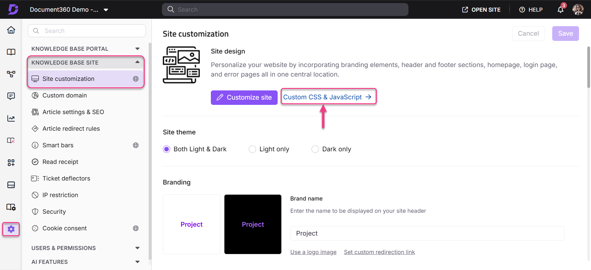
-
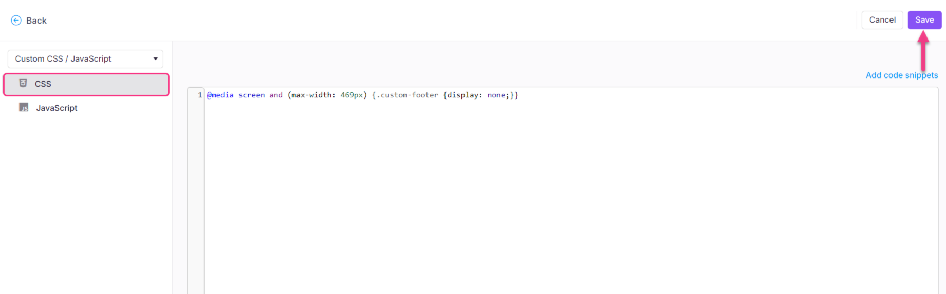
From the left navigation pane, select the CSS tab and paste the following snippet.
Hides the footer on screens up to 767px wide (smartphones and smaller tablets).
@media only screen and (max-width: 767px) {
    site-footer-section {
        display: none;
    }
}
-
Click Save at the top right.
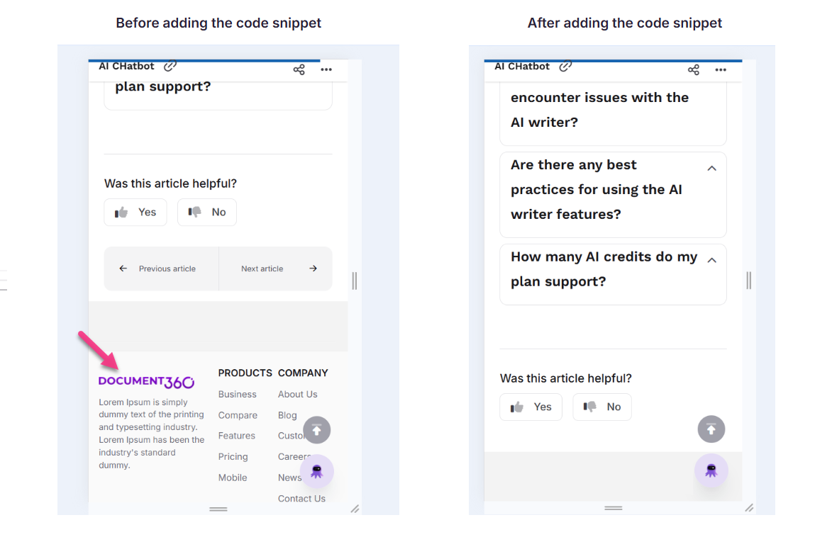
Outcome
The footer is hidden on mobile screens and continues to display on desktop screens as usual.
Best practices
- Adjust the breakpoint to match your layout if needed. If your custom footer starts looking problematic at a wider or narrower width than the default, change the
max-widthvalue in the snippet. For example, usemax-width: 1024pxto also hide the footer on tablets. - Test on a real device after saving. Browser developer tools provide a reasonable mobile preview, but testing on an actual smartphone confirms the footer disappears at the right breakpoint and the page layout remains correct.
- Consider what you are hiding. If your custom footer contains important links, such as contact information, legal notices, or support links, ensure these are accessible to mobile readers through other means, such as the site header or article navigation.
- To revert, delete the snippet. Navigate back to the CSS tab in Custom CSS & JavaScript, remove the snippet, and click Save. The footer reappears on mobile immediately.