The Multicolumn card section allows you to add lists of features, an About section, or a Contact section to your homepage. Each column includes an icon, a title, and a description field. Using Multicolumn cards on your homepage creates a visually appealing structure that engages users, helps them quickly find key information, and highlights your core offerings.
For example, a software company could use the Multicolumn card section on its homepage to showcase key product features, such as Data Security, User Management, and 24/7 Support. Each column could display an icon representing the feature, a concise title, and a brief description. This setup provides a quick interactive view of the software's benefits, helping potential customers quickly understand the product's value.
Adding Multicolumn cards
To add a Multicolumn card section in the Knowledge base site, follow the steps below:
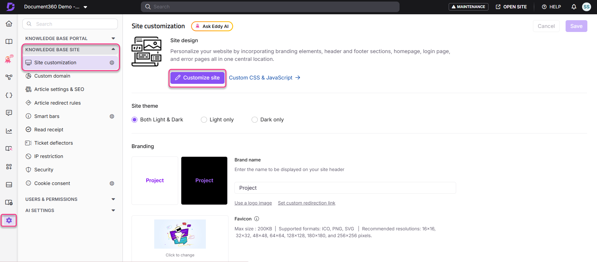
Navigate to Settings () in the left navigation bar in the Knowledge base portal.
In the left navigation pane, navigate to Knowledge base site > Site customization.
Click Customize site to access the design configurations on the Customize site page.
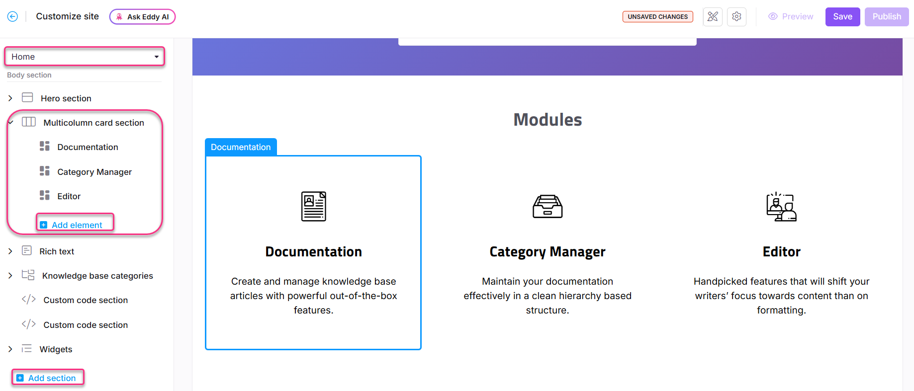
From the left-side drop-down menu, select the Home page to customize.
The body section will display a list of body blocks.
Click Add section, then select Multicolumn card section.
By default, the multicolumn card section includes three elements.
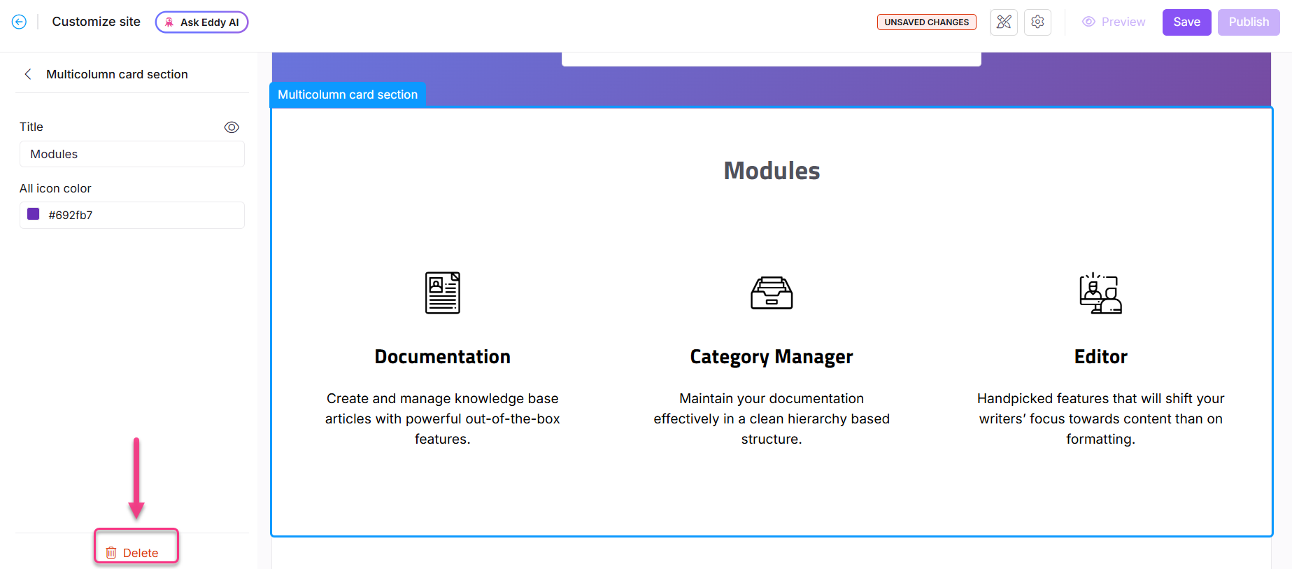
Click the Multicolumn card section to edit the title and overall icon color for the section.
To add more column elements, click Add element under the Multicolumn card section.
The Reorder () icon facilitates the rearrangement of elements.
Click the Hide () icon to toggle the visibility of elements.
Available options for elements
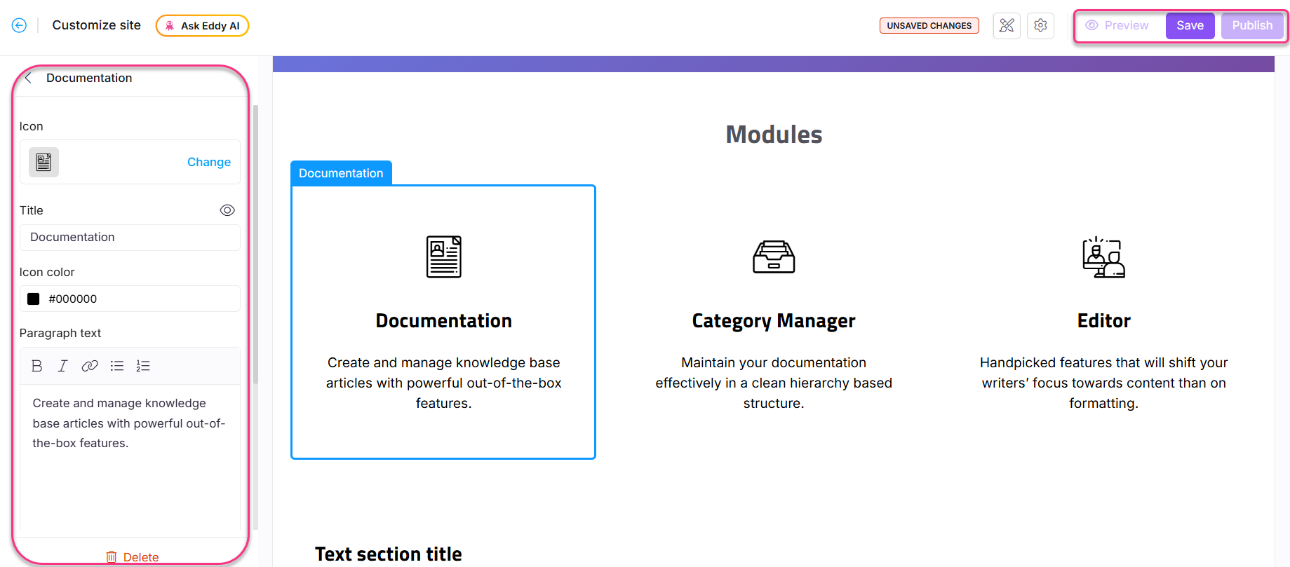
Click an element to edit the following attributes:
Icon:
Click Change to update icons for each column.
In the Icons tab, select a Document360 or Font Awesome icon.
In the Image tab, either enter the image URL or upload one from the Drive.
Title: Enter a title for the element. Click the Hide () icon to hide it.
Icon color: Change the icon’s color.
Paragraph text: Enter the description for each column. The following formatting options are available:
Bold (): Apply bold formatting to text.
Italic (): Apply italic formatting to text.
URL/Link (): Add URLs or hyperlinks within the text.
Unordered list (): Add a bulleted list.
Ordered list (): Add a numbered list.
Click Save to save your changes without applying them immediately.
Click Preview to see how your changes will appear on the knowledge base site.
Click Publish to make your recent changes visible to readers.
Click the More () icon and select Reset to published version to discard all saved and unsaved customizations and revert to the last published version.
NOTE
The Reset to published version feature is available only for new Knowledge base site 2.0 projects created after March 29, 2025.
Removing the Multicolumn card
To delete a multicolumn card, follow the steps below:
Click the Multicolumn card section.
The Multicolumn card section navigation bar will appear.
Click Delete () in the navigation bar.
Click Yes in the Delete confirmation prompt.
FAQ
How can I update a Multicolumn card element’s icon using Font Awesome?
Navigate to Settings () in the left navigation bar in the Knowledge base portal.
In the left navigation pane, navigate to Knowledge base site > Site customization.
From the left-side drop-down menu, select the Home page to customize.
Click the desired element in the Multicolumn card section.
Click Change in the icon settings.
Expand the Font Awesome accordion, and enter the class name of the desired Font Awesome icon.
For example, for the code
<i class="fa-solid fa-files"></i>, the class name isfa-solid fa-files.