The Hero section is the full-width banner displayed at the top of your knowledge base home page. It is the first thing readers see when they visit your site - before they read a single article or click a single link. A well-configured Hero section immediately communicates what the knowledge base is about, surfaces the search bar for quick access, and gives readers a clear starting point through call-to-action buttons.
You can customize the Hero section's background, heading text, promotional text, buttons, and search bar to reflect your brand and guide readers from the moment they land on your site.
The Hero section is always present at the top of the home page and cannot be deleted or reordered.
When to use the Hero section elements
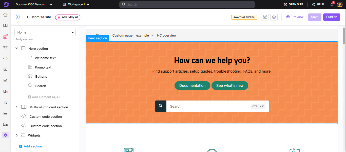
The Hero section contains four configurable elements. Not all of them need to be active, use only what serves your readers:
- Welcome text - Use this for a short, prominent heading that tells readers what the knowledge base is about. Works well for product names, taglines, or "Welcome to [Product] Docs"-style headings.
- Promo text - Use this for a short supporting message below the heading - a brief description, a key value proposition, or a prompt like "Find answers, guides, and tutorials."
- Buttons - Use these for direct navigation links. Common uses include linking to Getting Started, API docs, or a specific category. You can add up to three buttons.
- Search - Use this to surface the knowledge base search bar directly in the hero. Recommended for most knowledge bases - it gives readers immediate access to search without scrolling.
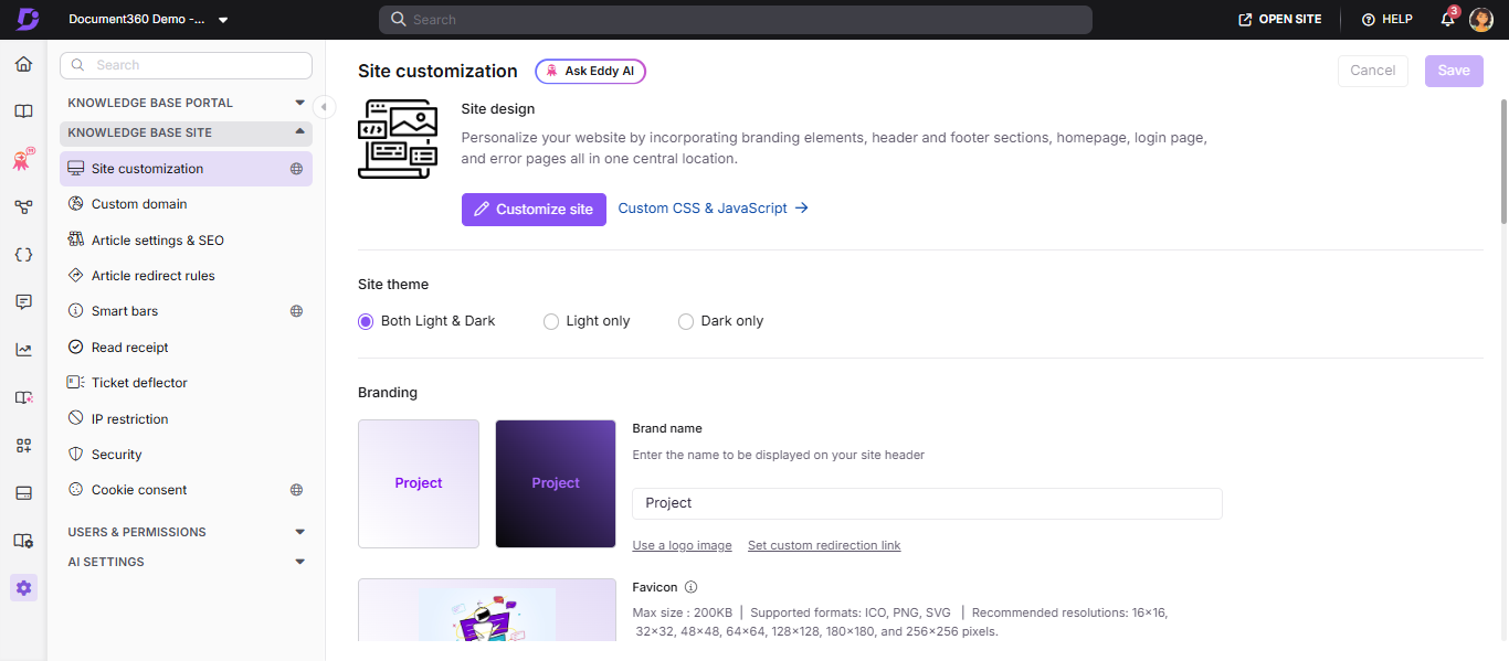
How to access the Hero section
- Navigate to Settings () in the left navigation bar of the Knowledge base portal.
- In the left navigation pane, navigate to Knowledge base site > Site customization.
- Click the Customize site button.
-
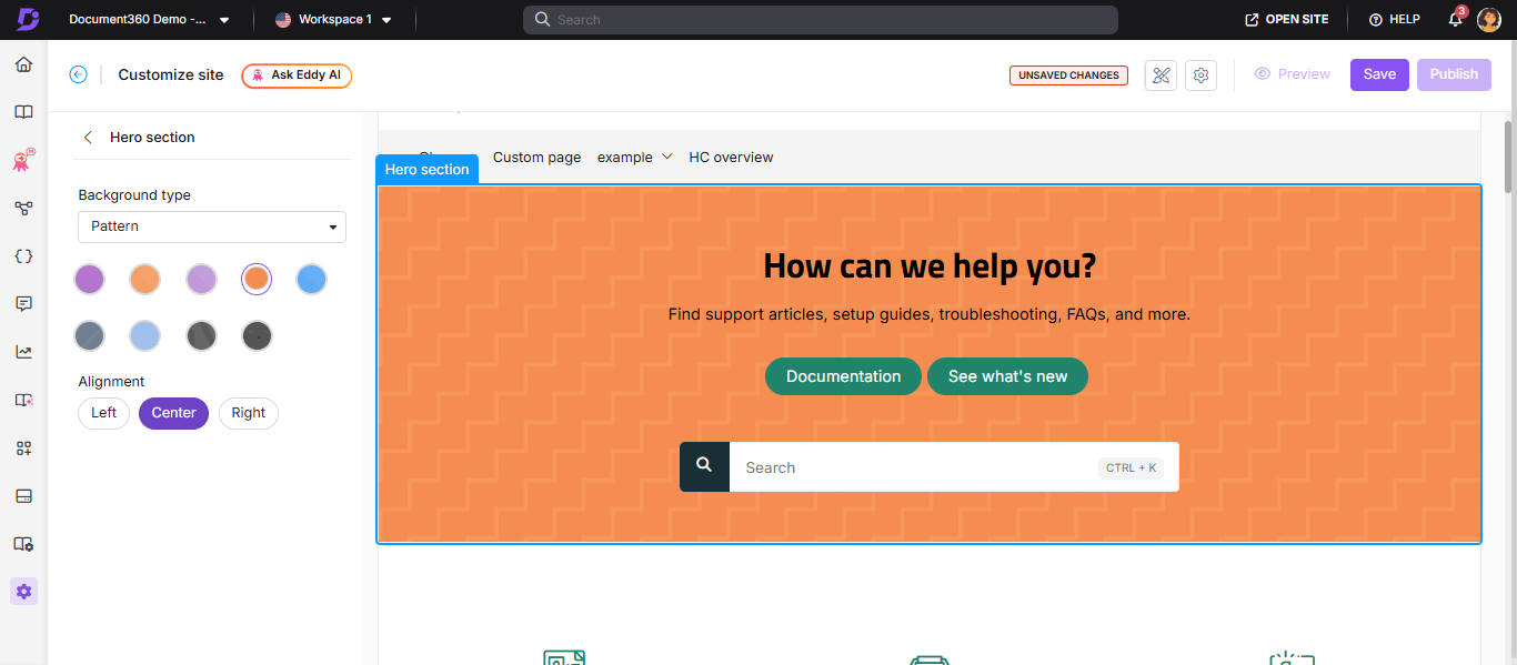
From the left dropdown, select Home.
The Body section lists all body blocks, with the Hero section at the top. -
Click the Hero section to begin customization.
How to customize the Hero section background
In the Background type dropdown, choose one of the following options:
| Background type | Description |
|---|---|
| None | No background. The default background color is white |
| Insert image | Upload an image from your Drive or enter an image URL |
| Color | Choose from available preset colors or use the custom color palette |
| Gradient | Select a gradient from the available options |
| Pattern | Choose a pattern from the available options |
In the Alignment field, choose Left, Center, or Right to align the text content within the Hero section.
How to configure Hero section elements
Expand the Hero section in the left panel to configure each element:
| Element | What you can configure |
|---|---|
| Welcome text | Enter a heading in the Heading text field. Choose a text color. Click to remove the element |
| Promo text | Enter supporting content in the Paragraph text field. Choose a text color. Click to remove the element |
| Buttons | Set text and button colors. Enter text and URL for each button. Click Add button to add up to three buttons. Use to delete or to hide individual buttons |
| Search | Choose search bar style: Input box or Button. Optionally select Custom background color - this prefills the primary color for both light and dark themes. Show keyboard shortcut is enabled by default, displaying Ctrl + K in the search bar. Click to remove the search element |
To hide any element without deleting it, hover over it in the left panel and click the Hide () icon.
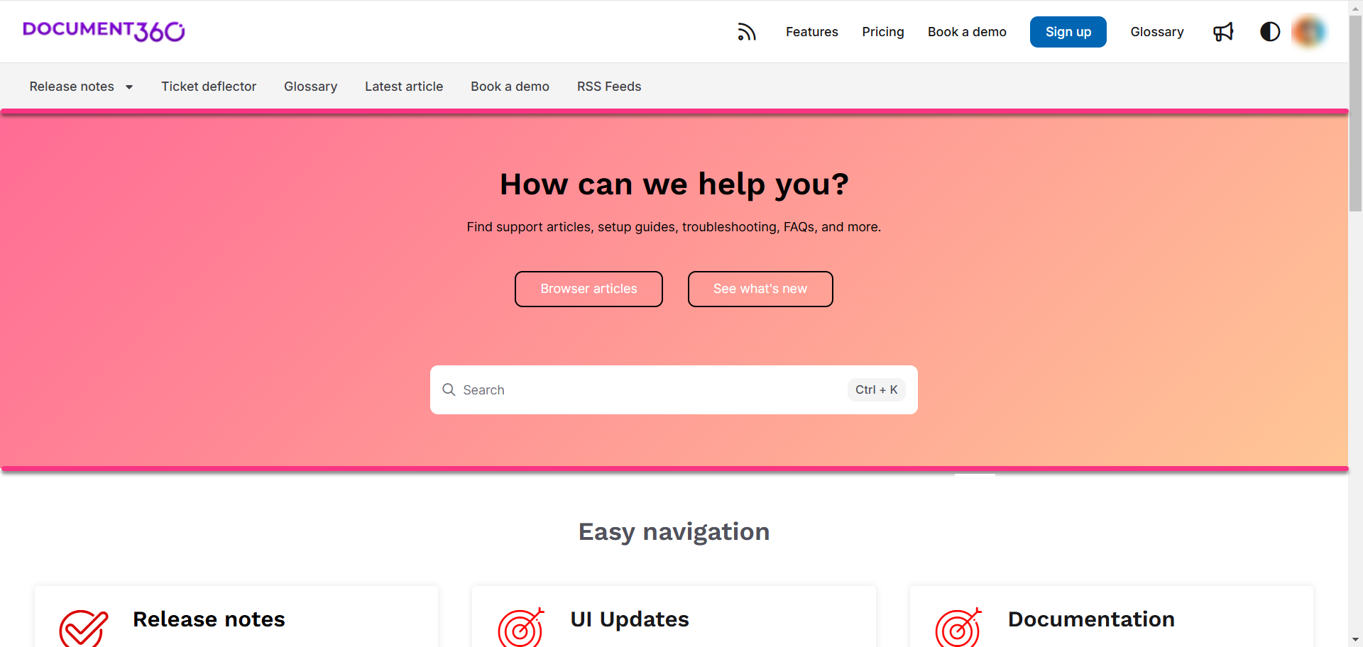
Knowledge base site view
Here is how a customized Hero section appears on the knowledge base site, with heading text, promo text, buttons, and search displayed together.
Best practices
- Keep the Welcome text short - one line works best. Long headings wrap awkwardly in the hero area and lose visual impact.
- Use Promo text to set expectations - a single sentence describing what the knowledge base covers helps readers orient themselves quickly.
- Limit buttons to two or three - too many options in the hero creates decision paralysis. Link to the most important destinations only.
- Always include the Search element - the hero search bar is the fastest path to answers for most readers. Only remove it if search is placed elsewhere on the page.
- Test your background choice in both light and dark mode - images and colors that look good in light mode may have low contrast or poor legibility in dark mode.
- Use Left alignment for text-heavy heroes - centered text works well for short headings but becomes harder to read at longer lengths.
FAQ
How do I change the Documentation button text on the home page?
Navigate to {{variable.Settings}} () > {{variable.Knowledge base site}} > Site customization and click Customize site. From the left dropdown, select Home. Expand the Hero section and select Buttons. Update the Documentation button text, click Save, then Publish.