Plans supporting this feature: Professional Business Enterprise
The Hero section in Document360 is a prominent feature displayed at the top of the Knowledge base site’s home page. It provides an opportunity to create a visually appealing introduction to your Knowledge base by customizing text, buttons, and the search bar. By tailoring the Hero section, you can ensure it reflects your brand and engages your audience effectively.
For instance, an organization can use the Hero section to prominently display a welcome message, highlight product updates, and provide quick navigation buttons to key resources. This makes it easier for users to find relevant information and creates a professional first impression.
Accessing Hero section
To access the Hero section:
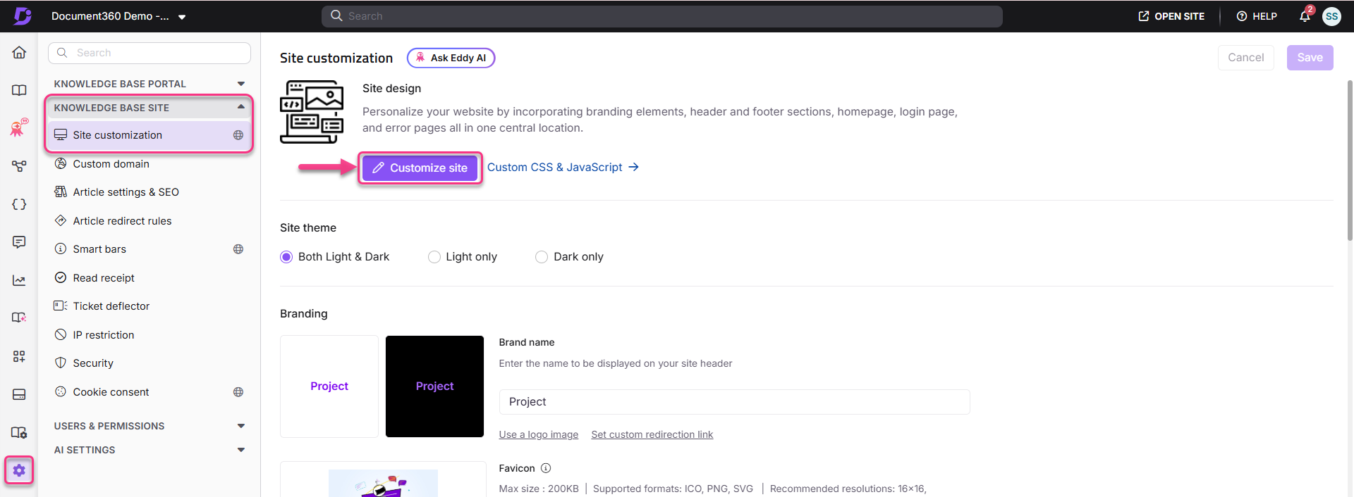
Navigate to Settings () in the left navigation bar in the Knowledge base portal.
In the left navigation pane, navigate to Knowledge base site > Site customization.
In the Site design section, click the Customize site button to access the design configurations.

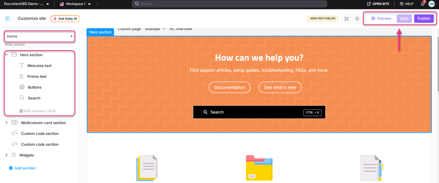
From the left dropdown, select Home.
The Body section lists all Body blocks, with the Hero section at the top.
NOTE
The Hero section at the top cannot be deleted or reordered.
Click the Hero section to perform customization.
Adding background to the Hero section
In the Background type dropdown, choose one of the following options:
Background type
Description
None
No background will appear. By default, the background color is white.
Insert image
In the Background image section, click Choose image to upload an image from your drive.
Alternatively, enter the image URL in the Image URL field.
Color
Choose a color from the available options or use the Custom color palette for a custom color.
Gradient
Select a gradient from the available options.
Pattern
Choose a pattern from the given options.
In the Alignment field, choose Left, Center, or Right to align the text in your Hero section.

Configuring the Hero section elements
Expand the Hero section in the left navigation bar and configure the following elements:
Element
Actions
Welcome text
Enter the desired title in the Heading text field.
Choose a text color using the Text color palette.
Click Delete () to remove this element.
Promo text
Enter the content in the Paragraph text field.
Choose a text color using the Text color palette.
Click Delete () to remove this element.
Buttons
Choose the text color using the Text color palette.
Choose the button color using the Button color palette.
Enter text in the First button text field.
Provide the URL in the First button url field.
Click Add button to add up to three buttons.
Use Delete () or Hide () icons to remove or hide buttons.
Search
Choose the desired search bar style: Input box or button.
Select the Custom background color checkbox to apply a customized color to the search bar.
NOTE
Selecting a custom background color automatically prefills the primary color for both Dark and Light themes.
The Show keyboard shortcut checkbox is selected by default.
If enabled, Ctrl + K will appear in the search bar. Readers can press Ctrl + K to access the search bar quickly.
This applies to both the search bar above the left panel (above the category tree) and the main home page search bar in the Knowledge base site.
Click Delete () to remove the Search element if needed.
Hover over any of the four elements (Welcome text, Promo text, Buttons, or Search) in the left navigation panel and click the Hide () icon to hide them from the Home page.
Click Preview to see how your changes will appear on the knowledge base site.
Click Save to save your changes without applying them immediately.
Click Publish to make your recent changes visible to readers.
Click the More () icon and select Reset to published version to discard all saved and unsaved customizations and revert to the last published version.
NOTE
The Reset to published version feature is available only for new Knowledge base site 2.0 projects created after March 29, 2025.

Knowledge base site view
Here's how the Hero section appears on the Knowledge base site. It showcases customized text, buttons, and search functionality designed to provide a welcoming and navigable interface for users.

FAQ
How do I change the Documentation button text on the Home page?
Hover on Settings () in the left navigation bar in the Knowledge base portal.
In the sub-menu, navigate to Knowledge base site > Site customization.
Click Customize site to access the design configurations.
From the left dropdown, select Home page.
The Body section lists all Body blocks, with the Hero section at the top.
Expand the Hero section and select Buttons.
Update the Documentation button text.
Click Save and then Preview to view the changes on the Knowledge base site.
Once done, click Publish to apply the changes.