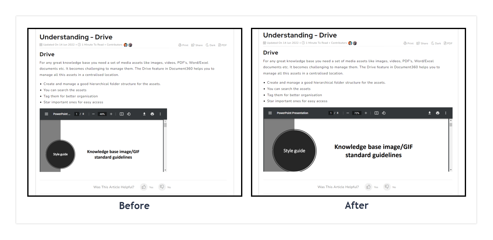
By default, the width of an embedded PDF preview in an article varies depending on the reader's browser. You can override this using Custom CSS to set the PDF preview to a consistent width, typically 100% of the article container, so the preview renders the same way for all readers regardless of their browser.
This workaround applies only to articles created in the Advanced WYSIWYG editor. PDF previews in Markdown editor articles are not affected.
When to use this fix
- Inconsistent PDF rendering across browsers: if readers report that embedded PDFs appear too narrow or vary in size, this fix standardizes the preview width.
- Improving readability of embedded PDFs: expanding the preview to full article width makes the document content easier to read without requiring the reader to zoom in or open the file separately.
This CSS change applies to all embedded PDF previews across all Advanced WYSIWYG editor articles on the site. It is not possible to target individual PDFs using this method.
Quick reference
Use the snippet for your Knowledge base site version.
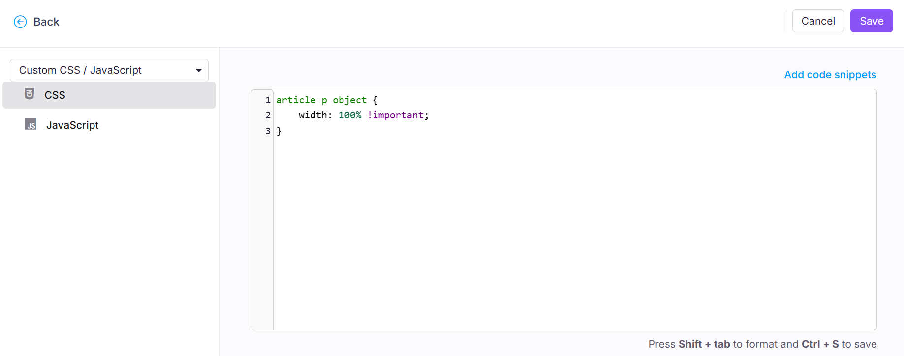
article p object {
    width: 100% !important;
}
How to set a consistent PDF preview width
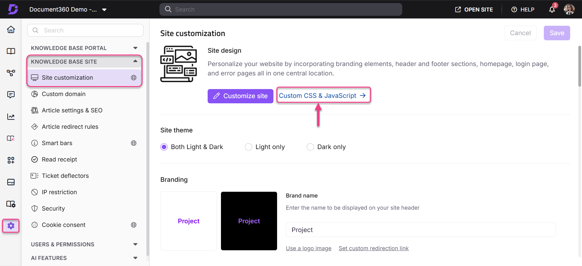
- In the Knowledge Base portal, go to Settings > Knowledge base site > Custom CSS & JavaScript.
- Select the CSS tab and paste the snippet for your Knowledge base site version from the quick reference above.
- Click Save.
Outcome
After saving the CSS, embedded PDF previews expand to the full width of the article container, displaying consistently across all browsers.
Scope and coverage
| Item | Detail |
|---|---|
| Scope | Global, all embedded PDF previews in all Advanced WYSIWYG editor articles |
| Editor support | Advanced WYSIWYG editor only, Markdown editor articles are not affected |
| Width applied | 100% of the article container |
| Custom width | Replace 100% with a specific value (e.g. 80% or 600px) if you prefer a fixed or reduced width |
Best practices
- Test across browsers after applying: verify the PDF preview renders correctly in Chrome, Firefox, Safari, and Edge to confirm the fix works as expected across your readers' most common browsers.
- Use a percentage rather than a fixed pixel width:
100%adapts to different screen sizes and article layouts. A fixed pixel value such as800pxmay overflow on narrower screens or mobile devices. - Consider reducing width if the article layout is narrow: if your article template uses a two-column layout or has a narrow content area,
100%may still produce a smaller preview than expected. In that case, check whether widening the content container or adjusting to90%improves the result.