By default, the height and width of an embedded PDF preview in an article varies depending on the reader's browser. You can set a consistent fixed size for all PDF previews using Custom CSS, so the preview renders at the same dimensions for all readers.
This workaround applies only to articles created in the Advanced WYSIWYG editor. PDF previews in Markdown editor articles are not affected.
When to use this fix
- Inconsistent PDF preview sizes across browsers: browsers render embedded PDF objects at different default dimensions. This fix enforces a consistent size.
- Controlling preview prominence: set a larger height to give the PDF more vertical space on the page, or a smaller size to keep it compact alongside surrounding content.
The CSS selector object targets all <object> elements on the site, not just PDF embeds. If your knowledge base uses <object> tags for other content types (such as SVGs or other embedded media), those will also be resized by this snippet.
Quick reference
Replace 500px with your desired height and width values.
object {
    height: 500px !important;
    width: 500px !important;
}
How to set PDF preview height and width
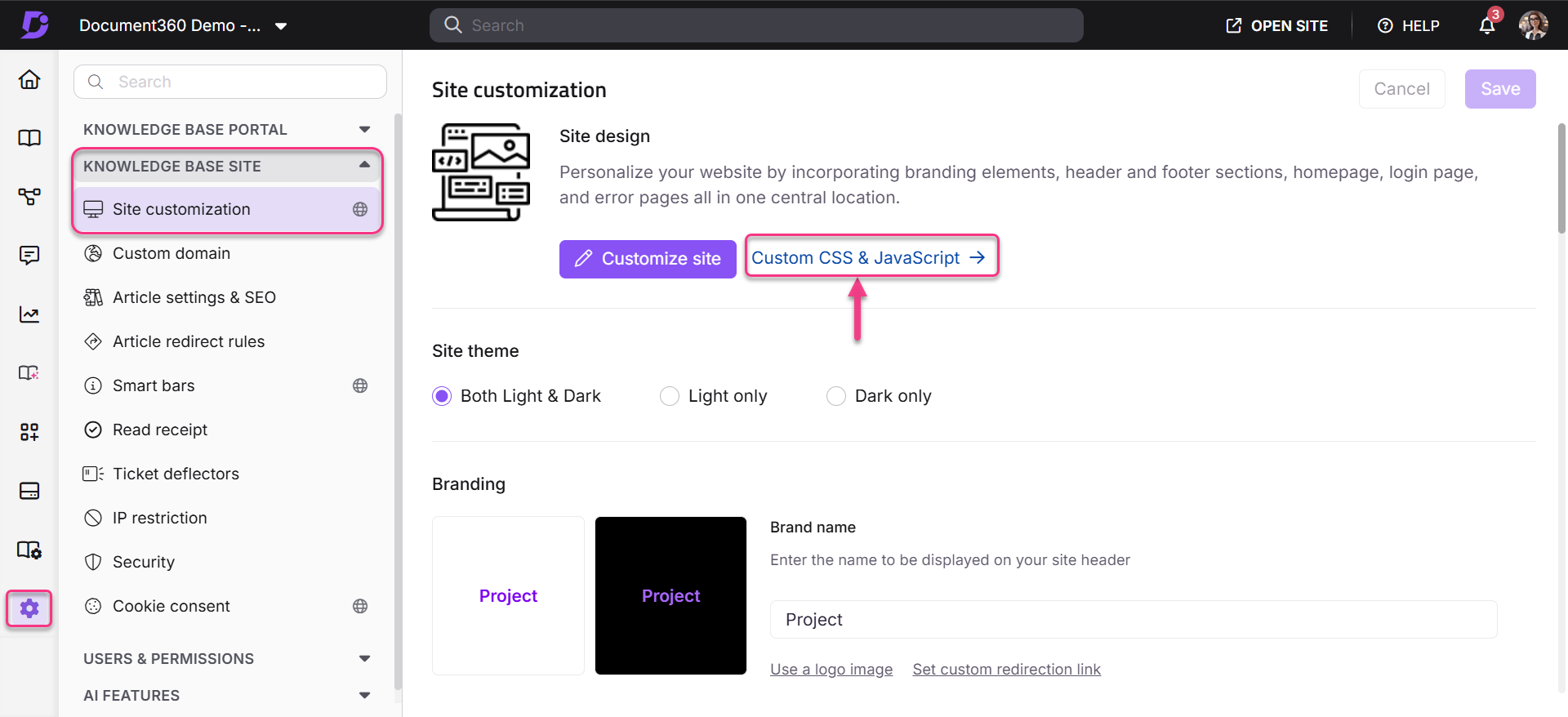
- In the Knowledge Base portal, go to Settings > Knowledge base site > Custom CSS & JavaScript.
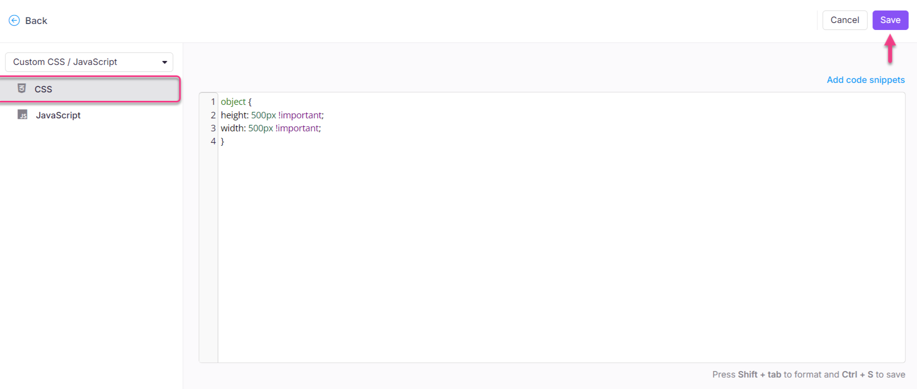
- Select the CSS tab and paste the following snippet:
object {
    height: 500px !important;
    width: 500px !important;
}
- Replace both
500pxvalues with your desired height and width. - Click Save.
Outcome
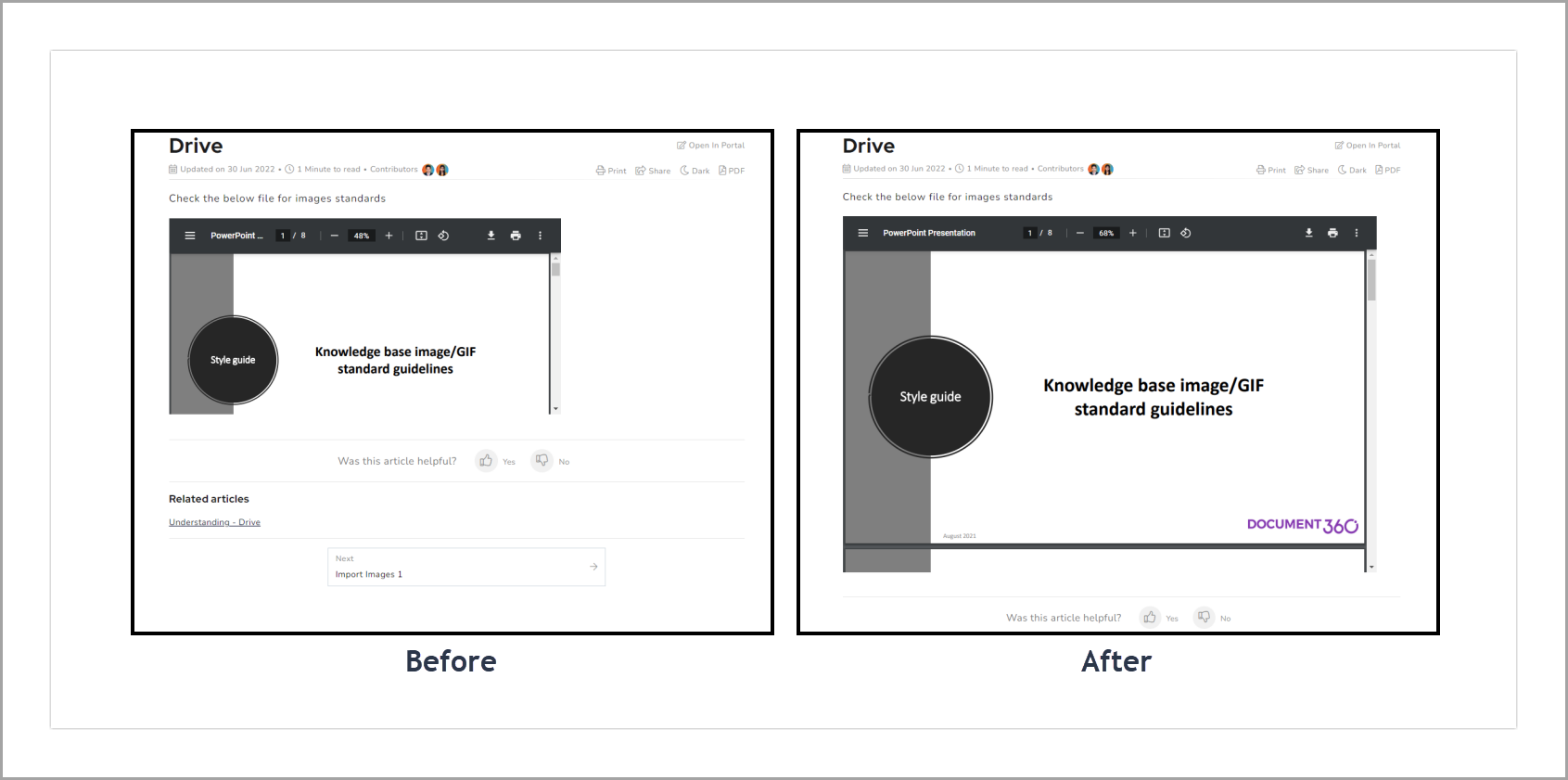
After saving the CSS, embedded PDF previews render at the specified fixed dimensions across all browsers.
Scope and coverage
| Item | Detail |
|---|---|
| Scope | Global, all <object> elements across all WYSIWYG editor articles |
| Editor support | Advanced WYSIWYG editor only. Markdown editor articles are not affected |
| Default example size | 500px × 500px, adjust to your layout needs |
| Height and width | Set independently, you can use different values for each |
| Percentage values | Supported, use width: 100% to fill the article container width |
Best practices
- Set width to a percentage rather than a fixed pixel value where possible:
width: 100%fills the article container and adapts to different screen sizes, while a fixed500pxmay overflow on narrow screens or appear too small on wide ones. Use fixed values only when you need a precise, unchanging size. - Set height relative to your PDF content: a height that is too small forces readers to scroll within the preview panel. Consider
600pxor700pxfor a standard A4-portrait PDF to show at least one full page without scrolling. - Test on mobile after applying: fixed pixel dimensions do not scale down on small screens. If your knowledge base has significant mobile traffic, check that the PDF preview does not overflow the article layout on narrow viewports.
- Use a more specific selector if needed: if the broad
objectselector affects other embedded content on your site, replace it with a more targeted selector. For example,article p objectlimits the scope to<object>elements inside article paragraphs.