The secondary navigation is a menu bar that appears below the logo in the header of your knowledge base site. While the primary navigation holds your most important top-level links, the secondary navigation gives you a separate, flexible space for additional destinations - including dropdown menus with sub-items. Think of it as an overflow area that keeps your primary navigation clean while still making more destinations accessible from every page.
When to use the secondary navigation
- Group related links under a dropdown - use the Multiple level type to create a single header item with sub-menu links underneath, such as a "Resources" dropdown with links to release notes, API docs, and a changelog.
- Add quick-access links for frequently visited sections - if readers regularly navigate to specific pages such as Pricing, Support, or Getting Started, placing these in the secondary navigation keeps them accessible without consuming primary navigation slots.
- Surface a ticket deflector - add a support form link directly in the header so readers can raise a ticket without leaving the knowledge base.
- Link to a custom page - surface a Terms & Conditions, Privacy Policy, or Contact page directly from the header.
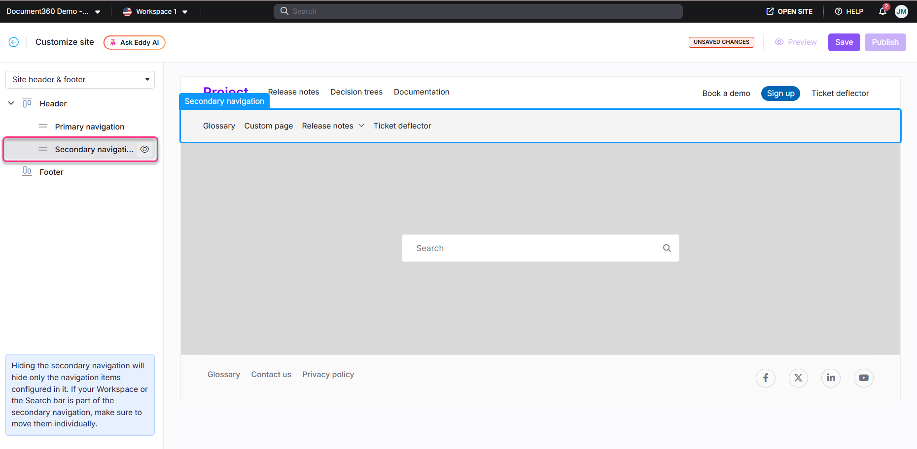
The header, primary navigation, secondary navigation, and footer displayed on the home page are configured under Settings () > Knowledge base site > Customize site > Site header & footer.
How to configure the secondary navigation
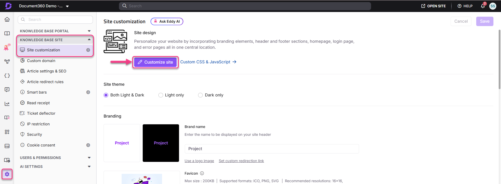
- Navigate to Settings () > Knowledge base site in the left navigation bar of the Knowledge base portal.
- In the left navigation pane, navigate to Site customization.
- Click the Customize site button.
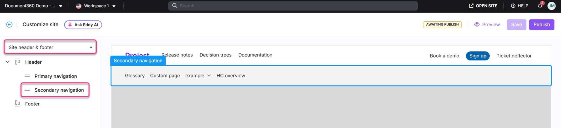
- From the left dropdown, select Site header & footer.
- Expand Header, then select Secondary navigation.
- Click Add new item. The Add new item panel appears.
- In the Select type dropdown, choose the navigation type.
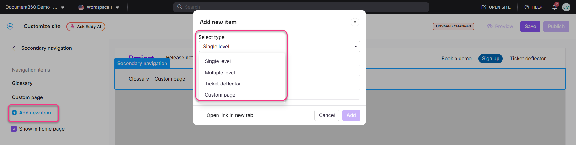
Navigation types
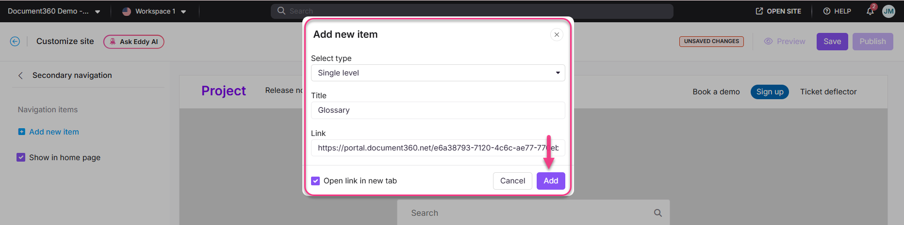
Single level
Single level is selected by default. It adds a single menu item with no sub-items.
- In the Title field, enter the text to display on the menu bar.
- In the Link field, add a hyperlink, email address, or telephone number.
- Select the Open link in new tab checkbox if needed.
- Click Add.
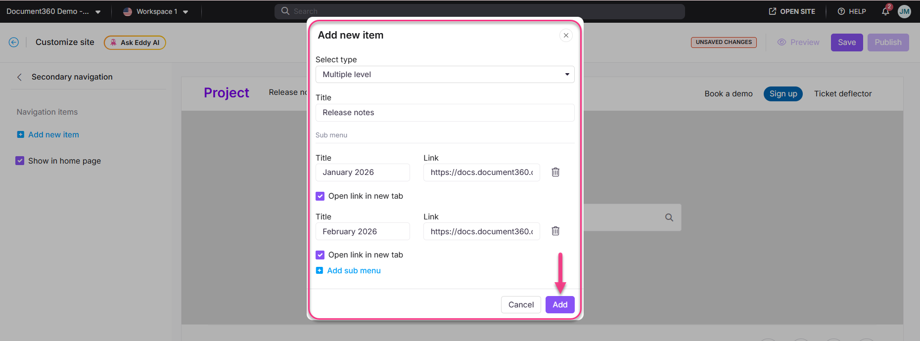
Multiple level
Multiple level creates a dropdown menu with sub-items under a single parent item.
- In the Title field, enter the main menu title.
- Click Add sub menu to add sub-items.
- For each sub-item:
- Enter the Title.
- Add a hyperlink, email address, or telephone number in the Link field.
- Select Open link in new tab if needed.
- Click Add.
- Click the Delete () icon to remove a sub-item.
- Once done, click Add.
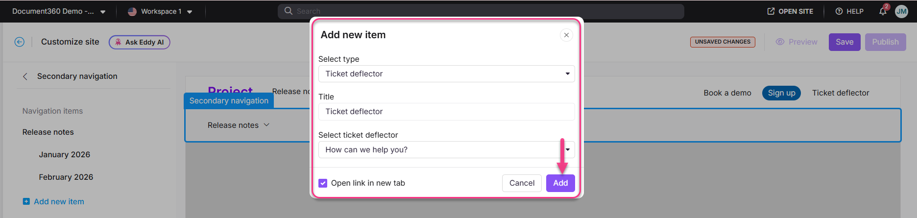
Ticket deflector
- In the Title field, enter the text to display on the menu bar.
- In the Select ticket deflector dropdown, choose the desired ticket deflector.
- Select Open link in new tab if needed.
- Click Add.
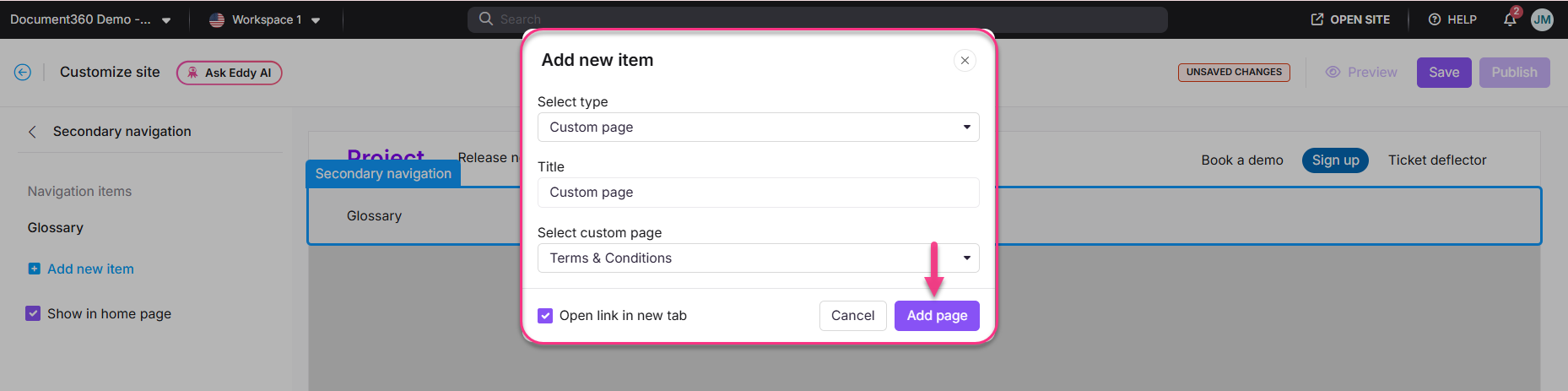
Custom page
- In the Title field, enter the text to display on the menu bar.
- In the Select custom page dropdown, choose the desired custom page.
- Select Open link in new tab if needed.
- Click Add page.
Managing secondary navigation items
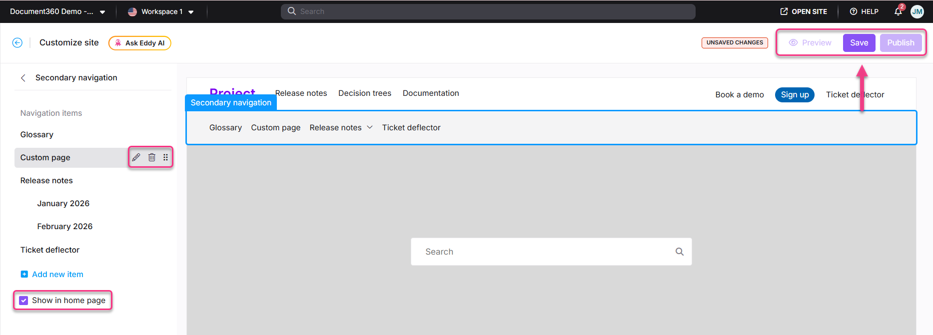
Hover over any navigation item in the left panel to access the following options:
- Edit () - modify the item.
- Delete () - remove the item.
- Reorder () - drag to rearrange items.
Select the Show in home page checkbox to display the secondary navigation bar on the knowledge base home page.
How to show or hide the secondary navigation header
- Navigate to Settings () > Knowledge base site > Site customization and click Customize site.
- From the left dropdown, select Site header & footer.
- Expand Header, then hover over Secondary navigation.
- Click the Show/hide () icon to display or hide the secondary navigation header on the site.
The show/hide icon applies only to navigation items added in the secondary header. It does not affect the workspace menu or search bar visibility. If the secondary header contains neither the workspace menu nor the search bar and has no navigation items, it will automatically collapse.
How to save and publish
- Use the Preview toggle on the right to review your changes.
- Click Save to save your changes.
- Click Publish to make changes live.
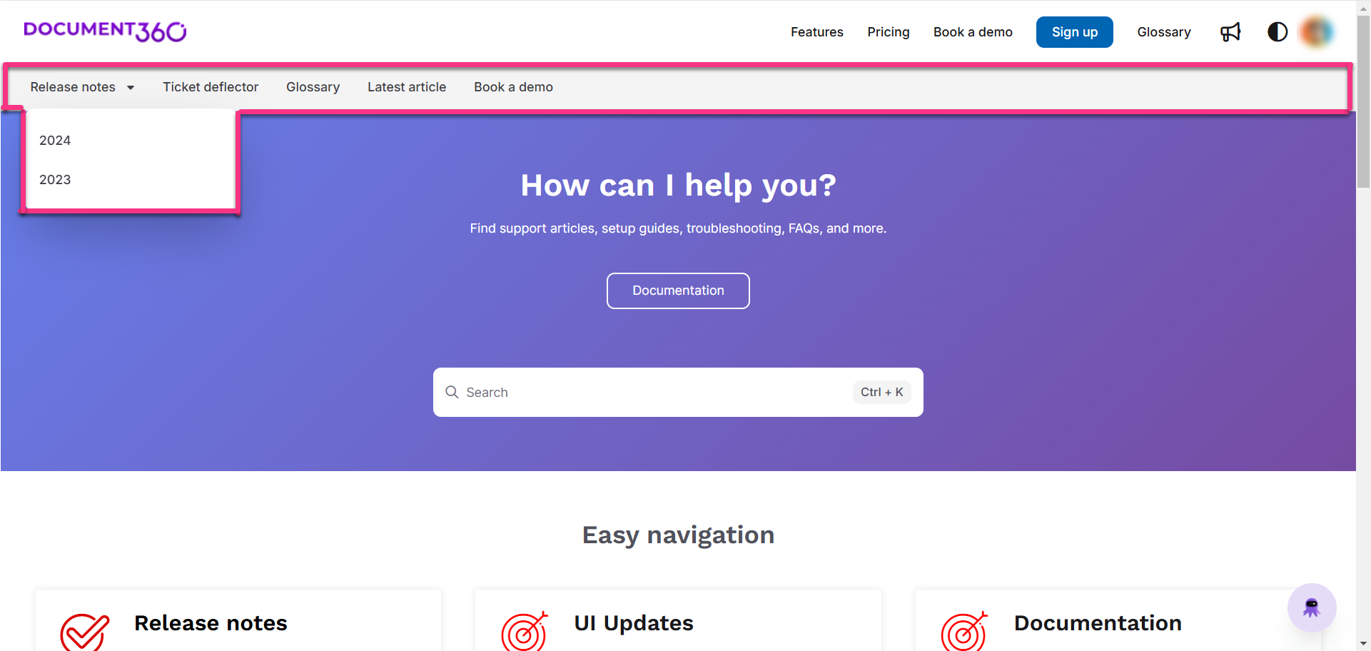
Knowledge base site view
Here is how the secondary navigation appears on the knowledge base site, with single-level navigation (Glossary), multiple level navigation (Release notes), and a ticket deflector.
Best practices
- Use Single level for standalone links - if a destination doesn't need sub-items, Single level keeps the header clean and simple.
- Limit Multiple level dropdowns to one level deep - deep nested menus are harder to navigate on mobile and small screens.
- Use Show in home page selectively - not all secondary navigation items need to appear on the home page. Enable this only for items that are relevant to first-time visitors.
- Keep item labels short - secondary navigation labels appear in a bar below the primary nav. Long labels break the layout on smaller viewports.
FAQ
Will hiding secondary navigation items affect the visibility of the workspace menu or search bar?
No. Hiding secondary navigation items does not affect the workspace menu or search bar. If the Display workspace as a menu option is enabled and the search bar is placed in the secondary header, both elements remain visible even when the secondary navigation header is hidden. However, if the secondary header contains neither the workspace menu nor the search bar and has no navigation items, it will automatically collapse and not be displayed.
Why does a search icon appear in the secondary navigation when the search bar is set to the Left panel?
When the search bar is configured to appear in the Left panel, it may scroll out of view when the category tree is collapsed. In such cases, a search icon appears in the secondary navigation to ensure search remains accessible while browsing the knowledge base.