Je kunt de kleur van elke map of submap in je Drive veranderen om het visueel beter te onderscheiden van andere. De standaard mapkleur is grijs. Kleuren worden toegepast op het mappictogram en zijn zichtbaar voor alle bijdragers die toegang hebben tot de Drive.
Waarom de mapkleur veranderen
Het kleurcoderen van je Drive-mappen is een lichte maar effectieve manier om de navigatiesnelheid te verbeteren en de kans te verkleinen dat bijdragers assets op de verkeerde locatie uploaden. Het werkt vooral goed naarmate je Drive groeit en mappen moeilijker te scannen worden in één oogopslag.
Veelvoorkomende redenen om mapkleuren te gebruiken zijn:
- Verschillende maptypes in één oogopslag. Wijs een consistente kleur toe aan alle systeem-gerelateerde mappen, alle productspecifieke mappen of alle archiefmappen zodat bijdragers zich direct kunnen oriënteren.
- Matchen met je categoriestructuur. Als je kennisbank visuele groeperingen of kleurgecodeerde secties gebruikt, versterkt het toepassen van dezelfde kleuren op de bijbehorende Drive-mappen de verbinding tussen content en assets.
- Mappen markeren die aandacht nodig hebben. Gebruik een aparte kleur zoals rood of oranje om mappen te markeren die tijdelijk, in beoordeling of aan het opruimen zijn.
- Ondersteuning van multi-team omgevingen. Wijs per team of afdeling een kleur toe, zodat bijdragers direct kunnen herkennen welke mappen bij hun gebied horen.
Verander de kleur van een map
Om de kleur van een map te veranderen,
- Beweeg je muis over de gewenste map in het linker navigatiepaneel en klik op het Meer-icoon .
- Klik op Kleur wijzigen. Er verschijnt een kleurkeuze.
- Selecteer een kleur uit het palet of voer een hexcode in om een aangepaste kleur toe te passen.
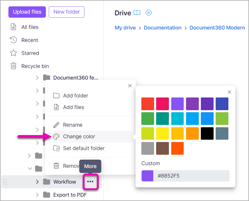
Het mappictogram wordt direct bijgewerkt om de geselecteerde kleur weer te geven.
Kleuropties
De kleurkieser biedt twee manieren om een kleur te kiezen:
| Optie | Hoe gebruik je het |
|---|---|
| Vooraf ingesteld palet | Klik op een willekeurige kleur uit het palet van veelvoorkomende kleuren. Het map-icoon wordt onmiddellijk bijgewerkt. |
| Aangepaste Hex-code | Voer een zes-teken Hex-code in (bijvoorbeeld, #2D6BE4) om een specifiek merk of aangepaste kleur toe te passen. |
| Kleurplukker | Gebruik de visuele kleurkiezer om elke kleur te selecteren door de selector over het kleurenspectrum te slepen. |
Best practices
- Definieer een kleurconventie voor je team. Mapkleuren zijn het meest nuttig wanneer ze een gedeeld systeem volgen. Documenteer je kleurenschema — bijvoorbeeld blauw voor productdocumentatie, groen voor release notes, rood voor gearchiveerde content — en deel het met alle bijdragers.
- Houd het palet klein. Te veel kleuren gebruiken haalt het visuele voordeel weg. Beperk je schema tot vier tot zes kleuren zodat elke kleur een duidelijke betekenis heeft.
- Gebruik kleur als secundair signaal, niet als het enige. Kleur alleen is niet genoeg om een grote Drive te organiseren. Combineer kleurcodering met duidelijke mappennamen en een structuur die je categoriehiërarchie weerspiegelt voor het beste resultaat.
- Gebruik grijs als neutrale standaard. Laat grijs voor mappen die niet in een specifieke kleurcategorie passen, of voor mappen die nieuw zijn en nog niet toegewezen. Op deze manier is een ongekleurde map zelf een signaal dat het aandacht nodig heeft.
- Denk aan toegankelijkheid. Niet alle bijdragers zien kleur op dezelfde manier. Koppel altijd mapkleuren aan beschrijvende mappennamen zodat de Drive navigeerbaar blijft zonder alleen op kleur te vertrouwen.