The AI Chart generator in Document360 converts selected text or tables in the Advanced WYSIWYG editor into visual charts — pie charts, flow charts, or tables — without leaving the editor or using a third-party tool. You highlight the content, choose a chart type, and Eddy AI generates the chart as an image that you can insert directly into your article.
For languages supported by Eddy AI, see Multilingual support for Eddy AI Writer Suite.
When to use the AI chart generator
- Visualising proportional data — convert lists of percentages, categories, or data segments into a pie chart to make distributions easier to read.
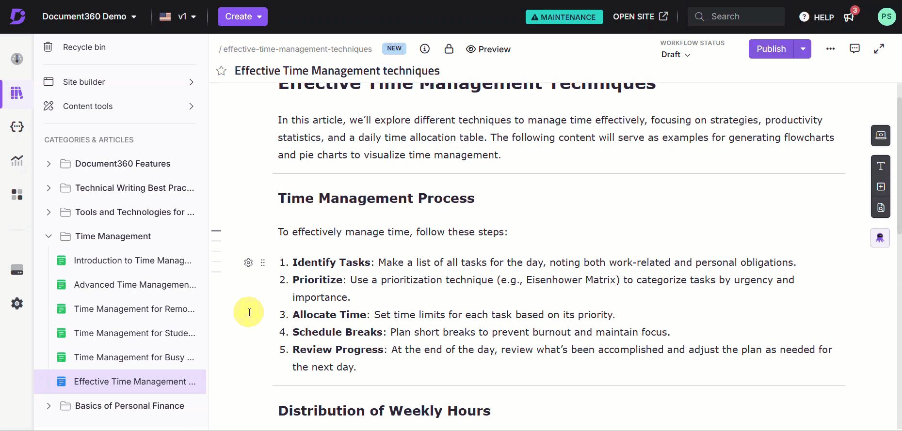
- Mapping processes and workflows — turn step-by-step procedures or decision sequences into a flow chart, such as an approval process or user onboarding workflow.
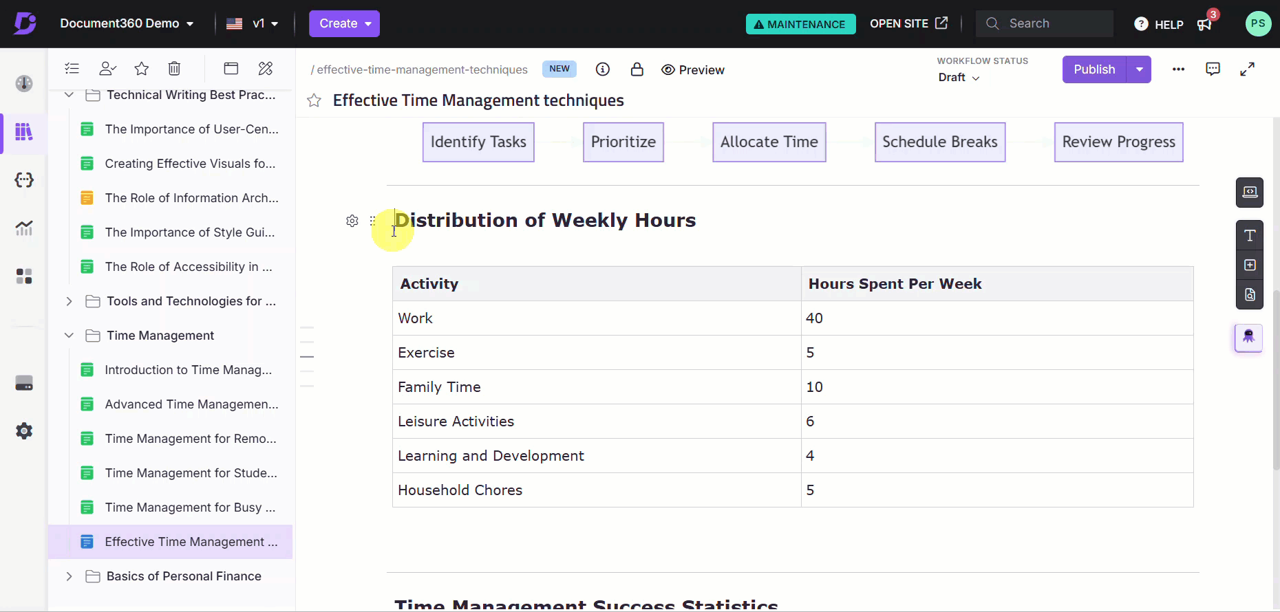
- Restructuring unformatted data as a table — convert prose descriptions of comparative data into a structured table for easier scanning.
- Converting existing tables into charts — if you already have a data table in your article, convert it into a pie chart or flow chart to give readers a visual alternative.
Before you begin
- The AI writer suite must be enabled in your Document360 account.
- The text or table you want to convert must be in the main body of the article. Content in comments or image captions cannot be used for chart generation.
How to generate a chart from text
-
In the Advanced WYSIWYG editor, highlight the text you want to convert into a chart.
-
Click the Eddy AI option in the floating bubble menu and select Generate from the dropdown.
-
Choose the chart type: Pie chart, Flow chart, or Table.
Eddy AI generates a chart from the highlighted text.
-
If the result is not satisfactory, click Regenerate. You can regenerate up to 10 times. Each regeneration is tracked and displayed in tabs so you can review previous versions and select the best one.
-
Once satisfied, choose how to insert the chart:
- Replace — replaces the highlighted text with the generated chart.
- Insert below — inserts the chart as an image below the selected text, leaving the original text in place.
If chart generation fails, the error message "No results found. Please revise the content or add more context and try again." appears. Dismiss it by clicking elsewhere on the screen or by clicking the close button.
How to generate a chart from a table
-
In the Advanced WYSIWYG editor, highlight the table you want to convert.
-
Click the Eddy AI option in the floating bubble menu and select Generate from the dropdown.
-
Choose the chart type: Pie chart, Flow chart, or Table.
Eddy AI generates a chart from the highlighted table.
-
If the result is not satisfactory, click Regenerate. You can regenerate up to 10 times, with each version tracked in tabs for comparison.
-
Once satisfied, choose how to insert the chart:
- Replace — replaces the table with the generated chart.
- Insert below — inserts the chart as an image below the table, leaving the original table in place.
The final chart you insert is saved to Drive > Images > Documentation, so you can reuse it in other articles. Charts generated during the regeneration process are not saved unless you insert them into the article.
How to customise a chart after inserting it
Once a chart is inserted into your article as an image, you can adjust it using the standard image editing options in the editor.
- Alignment and positioning — use the bubble menu to adjust the alignment or inline positioning of the chart image.
- Crop, resize, or annotate — use the image editing options in the editor to further modify the chart's appearance.
A chart cannot be edited directly once inserted. To change it, either undo the insertion (Ctrl+Z) to restore the original content and regenerate, or update the source text and generate a new chart.
Supported chart types
| Chart type | Best used for | Example |
|---|---|---|
| Pie chart | Showing distribution of parts within a whole — proportions, percentages, or data segments | Percentage of tasks completed by each team member |
| Flow chart | Mapping processes, workflows, or decision sequences step by step | Steps in a document approval process or user onboarding workflow |
| Table | Presenting structured data for easy comparison across categories | Comparing product features, service levels, or performance metrics |
Scope and coverage
| Item | Detail |
|---|---|
| Regeneration limit | Up to 10 times per chart (includes switching chart types) |
| Supported source content | Text and tables in the article body only |
| Unsupported source content | Comments, image captions |
| Chart output format | PNG image, saved to Drive > Images > Documentation |
| File naming | AI-generated name based on context, appended with chart type — for example, sales_data_pie_chart.png |
Best practices
- Use structured, numeric, or grouped data for best results — lists with numeric values, data grouped by category (e.g., by region or product type), and percentage breakdowns generate the most accurate charts. Unstructured prose is more likely to fail.
- Review all regeneration tabs before inserting — each regeneration is saved in a tab during the session. Compare all versions before committing to one, since an earlier version may be more accurate than the latest.
- Use "Insert below" when unsure — inserting the chart below the source content rather than replacing it lets you compare the chart against the original before deciding to remove the source text.
- Undo immediately if the replacement is wrong — if you replace content with a chart and the result is not what you wanted, press Ctrl+Z straight away. Once you navigate away or make further edits, reverting becomes harder.
- Reuse charts from Drive — inserted charts are saved to Drive > Images > Documentation. If the same chart is needed in another article, insert it from Drive rather than regenerating it.
FAQ
Why did chart generation fail and how can I fix it?
Generation can fail due to insufficient or incomplete data, unsupported source content (comments or captions), formatting issues, or content that exceeds data limits. To resolve it, use structured lists, numeric data, or logically grouped information — such as data grouped by region or product type. Revise the content to add more context, then try again.
Can I edit a chart after it has been inserted?
No. Once inserted, a chart cannot be edited directly. You can undo the insertion with Ctrl+Z to restore the original content, update the source text, and regenerate. You can also switch to a different chart type during regeneration without undoing.
Are all regenerated versions of a chart saved?
No. Only the final chart you insert into the article is saved to Drive. Charts generated during the regeneration session are available in tabs while you are working, but are not saved unless you insert them.
Where are generated charts saved in Drive?
Inserted charts are saved to Drive > Images > Documentation, where they can be reused in other articles.