The Colors and Typography settings in Document360 let you control the visual appearance of your knowledge base site, from the site theme and brand colors to fonts across articles and navigation. All settings are configured from Site customization and apply at the project level - the brand color flows into CTAs, selection states, and interactive elements; the hyperlink color controls how links appear across all articles; the article font pairing determines the fonts used in article titles and body content, and the same fonts appear in the editor so writers can preview how articles will look when published; the site font controls navigation, headers, footers, and controls separately from article content.
These settings work together to create a consistent visual experience for readers across every page.
When to update colors and typography
- When setting up a new knowledge base - establish your brand color, hyperlink color, and fonts as part of initial configuration so the site reflects your identity from the start.
- After a brand refresh - if your company updates its primary color, font, or visual guidelines, update the knowledge base settings to stay aligned.
- When readers report accessibility issues - use the Adjust color contrast to meet WCAG standards option to automatically apply WCAG-compliant contrast ratios based on your brand color.
- When switching between light and dark themes - colors that work in light mode may not have sufficient contrast in dark mode. Review and adjust both theme colors when enabling dual-mode support.
- When article content is hard to read - if readers find the default font too small, too dense, or mismatched with your product, update the article font pairing and site font to improve readability.
Site theme
The site theme controls which color modes are available to readers on your knowledge base site.
- Navigate to Settings () in the left navigation bar of the Knowledge base portal.
- In the left navigation pane, navigate to Knowledge base site > Site customization.
- In the Site theme field, select one of the following options:
- Both Light & Dark - Readers can switch between light and dark modes using the theme toggle in the site header.
- Light only - The site is always displayed in light mode. The theme toggle is hidden.
- Dark only - The site is always displayed in dark mode. The theme toggle is hidden.
- Click Save.
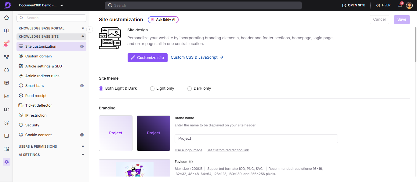
Colors
Brand color
The brand color is the primary color applied to CTAs, selection states, and interactive elements across your knowledge base site.
- Navigate to Settings () in the left navigation bar of the Knowledge base portal.
- In the left navigation pane, navigate to Knowledge base site > Site customization.
- In the Colors section, select a color using the color picker or enter a HEX code in the Brand color field.
- Click Save.
If Auto set color contrast to meet WCAG standards is enabled, both light and dark theme colors are set automatically based on your brand color. If it is disabled, you must manually set colors for each theme separately.
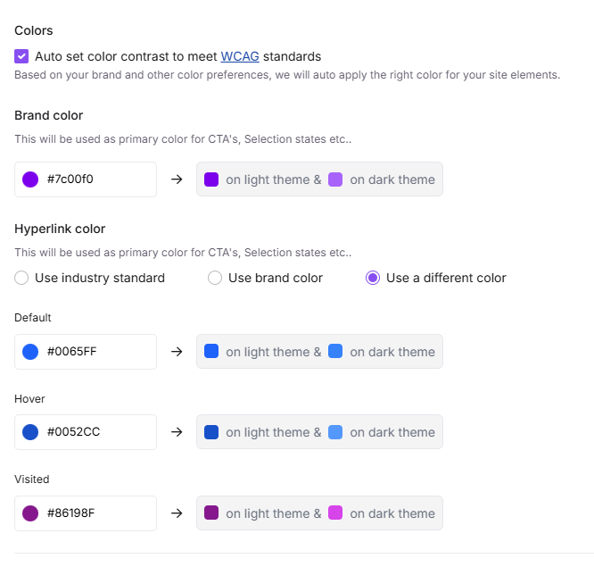
Hyperlink color
You can customize how hyperlinks appear across your knowledge base site. Three options are available:
| Option | What it does |
|---|---|
| Use industry standard | Applies the commonly used default hyperlink color |
| Use brand color | Applies the same color selected as your brand color |
| Use a different color | Lets you set separate default, hover, and visited colors for hyperlinks |
To set the hyperlink color:
- Navigate to Settings () in the left navigation bar of the Knowledge base portal.
- In the left navigation pane, navigate to Knowledge base site > Site customization.
- In the Colors section, go to Hyperlink color and select your preferred option.
- If you select Use a different color, configure the default, hover, and visited states.
- Click Save.
WCAG auto contrast
Enabling WCAG auto contrast automatically adjusts your site's color elements to meet WCAG 2.1 accessibility standards, based on your chosen brand color.
- Navigate to Settings () in the left navigation bar of the Knowledge base portal.
- In the left navigation pane, navigate to Knowledge base site > Site customization.
- In the Colors section, select the Auto set color contrast to meet WCAG standards checkbox.
- Click Save.
Typography
Article font pairing
Article font pairing controls the fonts used for article titles and article content across your knowledge base site. The selected fonts also appear in the editor, so authors can preview how articles will look when published.
- Navigate to Settings () in the left navigation bar of the Knowledge base portal.
- In the left navigation pane, navigate to Knowledge base site > Site customization.
- In the Fonts section, select a font pair from the Article font pairing tile. The first font applies to article titles, and the second to article content.
- To choose a specific combination, click Have a specific font combination in mind? to access additional font options and select fonts for titles and content individually.
- Click Save.
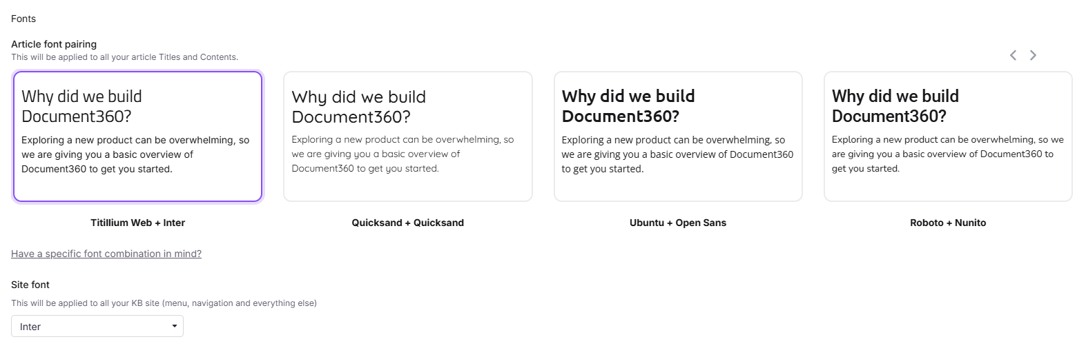
For example, if you draft content in Verdana in the Knowledge base portal but select Ubuntu + Open Sans as the article font pairing, the article title will appear in Ubuntu and the content in Open Sans on the knowledge base site.
Site font
The site font applies throughout the knowledge base site navigation — including the left navigation pane (categories, subcategories, article titles), header, footer, secondary navigation, and controls.
- Navigate to Settings () in the left navigation bar of the Knowledge base portal.
- In the left navigation pane, navigate to Knowledge base site > Site customization.
- In the Fonts section, select your preferred font from the Site font dropdown.
- Click Save.
For more information on how project-level font changes affect existing articles, deprecated fonts, and font management methods, see Managing fonts in your knowledge base.
Custom font
If the built-in font options don't match your brand, you can configure a custom font for your knowledge base site. For a step-by-step walkthrough, see How to configure a custom font in the knowledge base.
Best practices
- Enable WCAG auto contrast if accessibility compliance matters for your audience - it removes the guesswork of manually checking contrast ratios for every color combination.
- Set your brand color first before configuring hyperlink colors - if you plan to use brand color for hyperlinks, the brand color setting must be saved first.
- Test both light and dark modes after making color changes - a brand color that looks good in light mode may have low contrast in dark mode. Use the site preview to check both.
- Use article font pairing for readability - choose a pairing where the title font is distinct from the body font to create a clear visual hierarchy.
- Avoid frequent font changes - switching fonts after content is published can affect how existing articles render, especially if custom styles have been applied at the article level.