The Spotlight element allows you to draw viewer attention to a specific area of a step by dimming everything outside the defined spotlight region. All areas outside the spotlight region will be dimmed. Currently, the brightness level of the dimmed area cannot be adjusted.
Spotlight for real-world scenarios
| Scenario | Recommended Configuration |
|---|---|
| Guiding a user to click a specific button in a product demo | Rectangle shape, sized to cover the button |
| Highlighting an icon or status indicator | Circle shape, sized to the icon |
| Drawing attention to a navigation menu or sidebar item | Rectangle shape, covering the menu region |
| Focusing on a form field during an onboarding walkthrough | Rectangle shape, aligned to the input area |
Adding a spotlight element
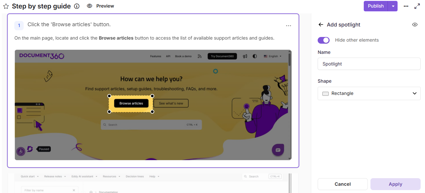
Add spotlight to a step by step guide
- Navigate to the step to which you want to add a spotlight.
- In the right pane, scroll to the Add elements section.
- Click Spotlight. If one or more spotlight elements have already been added, click Add new to insert another.
- Use the eye icon in the top-right of the Spotlight panel to toggle the visibility of the spotlight for the end user. Hidden spotlights will not be visible in the published Flo, but can be made visible again at any time.
- Enable the Hide other elements toggle to temporarily hide all other elements on the current step while configuring the spotlight. Other elements are hidden temporarily and are not deleted.
- In the Name field, enter a descriptive label for the spotlight element.
- Under Shape, choose a shape from the dropdown:
- Rectangle - best suited for highlighting buttons, form fields, panels, or horizontal UI regions.
- Circle - suitable for icons, avatars, or circular UI components.
- Click Apply to save the spotlight element.
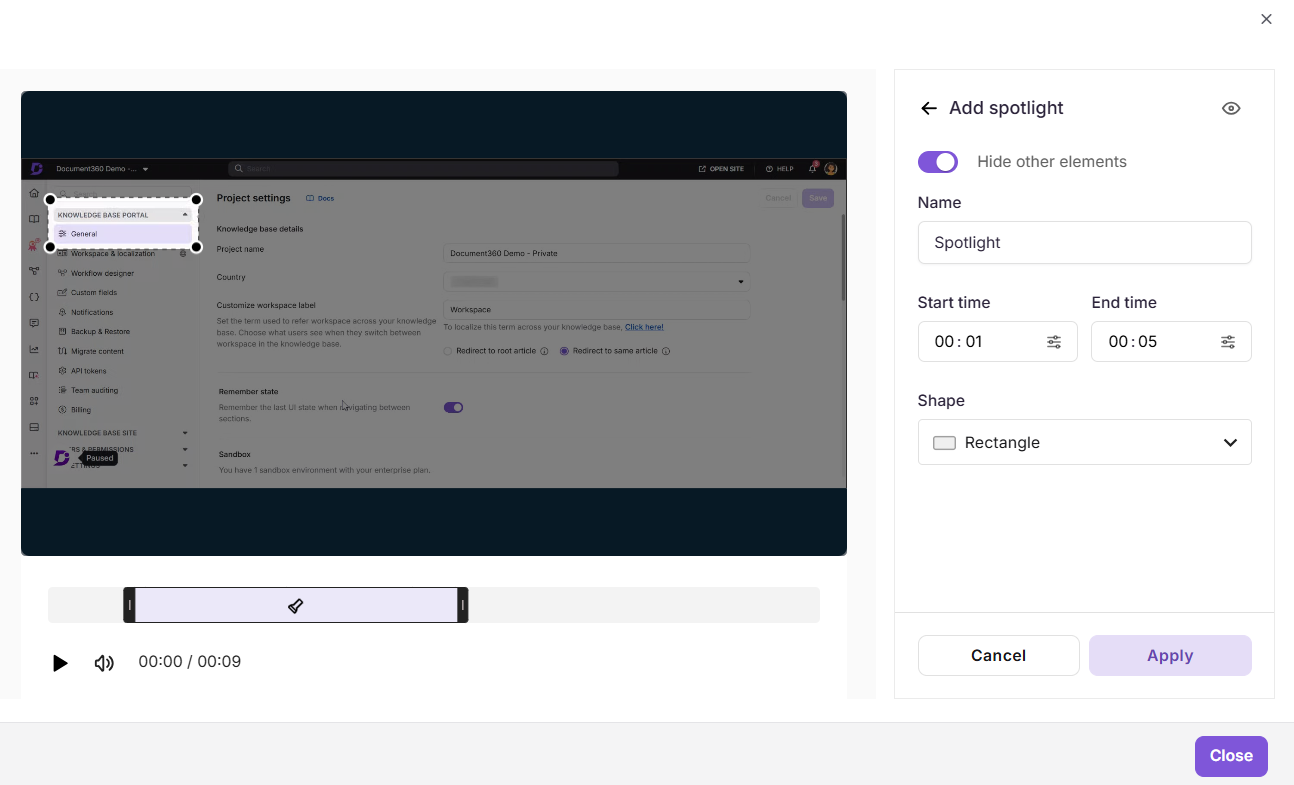
Add spotlight video / interactive demo
- Navigate to the step to which you want to add a spotlight.
- In the right pane, scroll to the Add elements section.
- Click Spotlight. If one or more spotlight elements have already been added, click Add new to insert another.
- Use the eye icon in the top-right of the Spotlight panel to toggle the visibility of the spotlight for the end user. Hidden spotlights will not be visible in the published Flo, but can be made visible again at any time.
- Enable the Hide other elements toggle to temporarily hide all other elements on the current step while configuring the spotlight. Other elements are hidden temporarily and are not deleted.
- In the Name field, enter a descriptive label for the spotlight element (e.g.,
Spotlight - Submit Button,Spotlight - Navigation Menu). - In the Start time field, enter the timestamp at which the spotlight should appear.
- In the End time field, enter the timestamp at which the spotlight should disappear.
- To select an exact frame, use the Select exact frame (15 fps) option. Use the arrow buttons to navigate frame by frame, or enter a frame number directly. Click Select to confirm or Cancel to discard.
- Under Shape, choose a shape from the dropdown:
- Rectangle - best suited for highlighting buttons, form fields, panels, or horizontal UI regions.
- Circle - suitable for icons, avatars, or circular UI components.
- Click Apply to save the spotlight element.
Managing spotlight elements
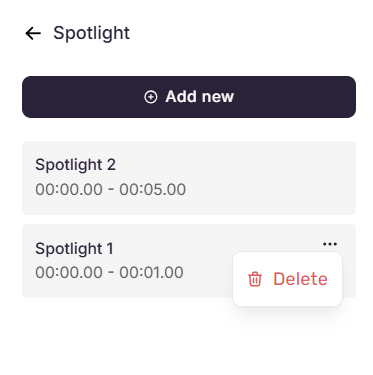
Once added, spotlight elements are listed in the Spotlight panel, each displaying the spotlight's name and the step it is applied to.
- Add another spotlight - Click Add new at the top of the panel to configure an additional spotlight element.
- Edit a spotlight - Click any spotlight in the list to open its configuration panel, where the name, step, and shape can be modified. Click Apply to save changes, Cancel to return to the Spotlight pane, or the Delete icon to delete it.
- Delete a spotlight - Hover over a spotlight in the list to reveal the three-dot menu. Click it and select Delete to permanently remove the spotlight element.
Best practices
- Use descriptive names - Label each spotlight clearly to make them easier to identify and manage, especially when multiple spotlights are applied across different steps.
- Hide rather than delete - Temporarily disable spotlights that are not needed instead of deleting them. This preserves the configuration for future use.
- Resize and reposition after applying - Ensure the spotlight precisely covers the intended area on the canvas.
- Use spotlights sparingly - Avoid applying spotlights across too many consecutive steps to retain their effectiveness.
- Preview after applying - Verify the dimmed region does not obscure other essential on-screen content.