The Styling and Layout settings in Document360 let you control the visual style of buttons and form elements, and how content is positioned across your knowledge base site. Both settings apply at the project level from Site customization - button style affects every button and form element across the site, while site layout determines whether your content fills the full browser width or sits centered with more whitespace around it.
These are small but visible settings. A button style that clashes with your product's UI design makes the knowledge base feel disconnected from your product, and a layout that's too wide can make long articles uncomfortable to read on large screens.
When to update styling and layout
- When setting up a new knowledge base - choose a button style and layout that matches your product's design system before publishing so the site feels intentional from day one.
- After a product redesign - if your product moves from rounded to sharp UI elements (or vice versa), update the knowledge base button style to stay consistent.
- When readers report that content feels too wide - on large monitors, Full width can stretch article text uncomfortably. Switching to Center layout constrains the reading column to a more comfortable width.
- When embedding the knowledge base in a product UI - Center layout often works better in embedded or iframe contexts where the viewport is constrained.
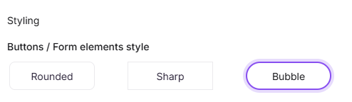
Button style
The button style controls the shape of buttons and form elements across your knowledge base site. Three options are available:
| Style | Description |
|---|---|
| Rounded | Buttons have softly rounded corners |
| Sharp | Buttons have straight, square corners |
| Bubble | Buttons have fully rounded, pill-shaped corners |
To change the button style:
- Navigate to Settings () in the left navigation bar of the Knowledge base portal.
- In the left navigation pane, navigate to Knowledge base site > Site customization.
- In the Styling section, select your preferred button style.
- Click Save.
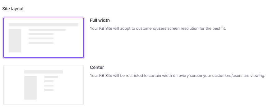
Site layout
The site layout controls how content is positioned within the browser window. Two options are available:
| Layout | Description |
|---|---|
| Full width | Content extends to the edges of the browser window |
| Center | Content is positioned centrally, providing a wider reading area by optimizing the surrounding panels |
To change the site layout:
- Navigate to Settings () in the left navigation bar of the Knowledge base portal.
- In the left navigation pane, navigate to Knowledge base site > Site customization.
- In the Site layout section, select Full width or Center.
- Click Save.
Best practices
- Use Full width for visual or dashboard-style content - if your knowledge base includes wide tables, images, or code blocks, full width gives them more room.
- Preview before saving - both button style and layout changes are project-wide, so use the site preview to check how changes look before clicking Save.
- Match button style to your brand - rounded and bubble styles suit friendly, consumer-facing products; sharp corners work better for technical or enterprise documentation.