The home page is the first page readers see when they visit your knowledge base site. It sets the tone for the entire documentation experience - a well-configured home page helps readers find what they need quickly, reflects your product's brand, and gives your knowledge base a purposeful feel rather than a generic out-of-the-box look.
In Document360, the home page is fully customizable. You can build it using a set of content blocks, apply a pre-built theme, configure SEO settings, and preview changes before publishing. All home page customization is managed through the Customize site builder.
Why customize the home page?
The default home page is a blank canvas - it won't surface your documentation structure, guide readers to the right section, or reflect your product's identity until you configure it. A customized home page does three things a default one cannot:
- Reduces time to first answer - a Knowledge base categories block or a Hero section with a search bar gets readers to the right content faster than leaving them to navigate the category tree on their own.
- Reflects your brand - applying a theme and configuring the Hero section with your brand colors and tone makes the knowledge base feel like a natural extension of your product rather than a separate tool.
- Communicates what's available - body blocks like Rich text, Multicolumn cards, and Image with text let you tell readers what the knowledge base covers, what's new, or where to start — especially useful for first-time visitors.
How to access the home page builder
- Navigate to Settings () in the left navigation bar of the Knowledge base portal.
- In the left navigation pane, navigate to Knowledge base site > Site customization.
- Click the Customize site button.
.png)
- From the left dropdown, select Home under Main pages.
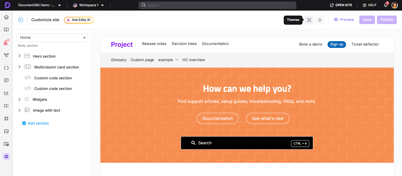
The home page builder opens with a live preview on the right. The different sections of the home page are listed on the left panel.
Home page sections
The home page is built from a fixed Hero section at the top, plus optional body blocks that you can add, reorder, and hide.
Hero section
The Hero section is the banner area at the top of the home page. It is always present and cannot be deleted or reordered. You can customize its background, text, buttons, and search bar. For a full walkthrough, see Hero section.
Body blocks
Body blocks are optional content sections you can add below the Hero section. To add a body block, click Add section and choose from the following options:
| Block | What it does | When to use it |
|---|---|---|
| Rich text | Add and format text content using Markdown | Announcements, onboarding context, or any free-form content that doesn't need a visual layout |
| Multicolumn card section | Display content in organized columns | Showcasing product features, key topics, team introductions, or a "what's in this knowledge base" overview |
| Image with text | Combine an image with a text description side by side | Feature highlights, release announcements, or visual introductions to a product area |
| Custom code section | Embed custom HTML and CSS | Dynamic banners, countdown timers, embedded third-party widgets, or any content requiring custom markup |
| Knowledge base categories | Surface categories from your knowledge base as visual cards | Helping readers navigate directly to major sections from the home page — especially useful for large knowledge bases with distinct product areas |
| Widgets | Add interactive elements such as surveys or contact forms | Ticket deflectors, feedback forms, or support widgets that you want readers to access from the home page |
To reorder body blocks, use the drag-and-drop () icon on the left panel. To hide a block without deleting it, click the eye () icon.
The header, primary navigation, secondary navigation, and footer displayed on the home page are configured separately under Settings () > Knowledge base site > Customize site > Site header & footer.
Home page themes
Document360 offers four pre-built themes for the home page. Each theme applies a distinct visual layout and style. You can configure a different theme per workspace or language.
| Theme | Description | Best suited for |
|---|---|---|
| Engage | A bold, visually rich layout with strong hero imagery | Marketing-style or customer-facing knowledge bases where first impressions matter |
| Innovate | A modern, dynamic layout with a tech-forward aesthetic | SaaS products, developer tools, or API documentation portals |
| Learn | A clean, content-focused layout with minimal distractions | Training portals, onboarding guides, or internal learning hubs |
| Default | The standard Document360 layout | General-purpose knowledge bases or when you want full control via custom CSS |
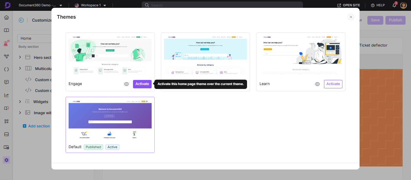
How to activate a theme
- Access the home page builder (see How to access the home page builder).
- Click the Themes () icon near the Settings () icon at the top of the builder.
The Themes panel appears.
- Hover over the desired theme and click Activate.
- Click the eye () icon on a theme to preview it. This is a static preview of the layout and design, and not a live preview.
- Click Save to save your changes without publishing.
- Click Publish to make the theme visible to readers.
If you have configured custom CSS, activating a new theme may break the home page layout. Remove existing custom CSS before switching themes.
How to discard a theme change
If you have activated a new theme but haven't published yet, you can revert to the last published theme.
- In the Themes panel, click Discard.
- Click Yes in the confirmation prompt.
The last published theme is restored.
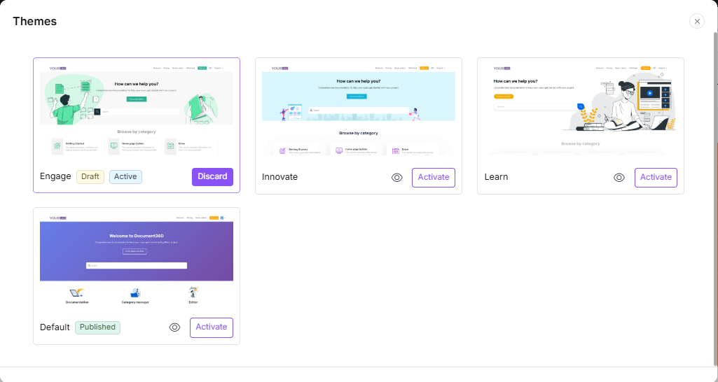
Theme status
Each theme in the panel displays one of three statuses:
| Status | Meaning |
|---|---|
| Published | The theme currently live on your knowledge base site |
| Draft | A theme change that has been saved but not yet published |
| Active | The theme currently configured for the home page. Appears in the Published section when no changes have been made, or in the Draft section when a new theme has been activated |
Theme behavior for new workspaces
When you create a new workspace using the Create a new workspace option, the Default theme is applied to the home page across all languages in that workspace.
When you create a new workspace using the Select an existing workspace option, the new workspace inherits the theme of the selected workspace's respective languages. Any new languages added will use the theme of the default language in the existing workspace.
When you add a new language to an existing workspace, its home page uses the theme configured for the default language in that workspace.
Home page SEO settings
You can configure SEO metadata for your home page to control how it appears in search engine results.
- In the home page builder, click the Settings () icon.
- Configure the following:
| Setting | Description |
|---|---|
| Title | The title shown in the browser tab for the home page |
| Meta description | A brief description shown in search engine results. Applies only to the home page |
| Visibility | Toggle on to keep the home page visible on the knowledge base site. Toggle off to hide it and readers will be directed to the documentation page instead |
| Featured image | Upload a featured image from the Drive |
- Click Save.
The recommended resolution for the home page featured image is 1920×415 pixels (width × height).
Save, preview, and publish
| Action | What it does |
|---|---|
| Save | Saves your changes as a draft, it will not be visible to readers yet |
| Preview | Opens a preview of how the home page will look on the knowledge base site |
| Publish | Makes all saved changes live and visible to readers |
Always click Publish after making changes. If the home page has unsaved or unpublished changes, readers may be redirected to an older version of the site even if the home page article is marked as published in the portal. The Publish button becomes active only after you save your changes first.
Best practices
- Save before publishing - always click Save first, then Publish. The Publish button is inactive until changes are saved.
- Preview before publishing - use the Preview option to verify how your home page looks for readers before going live.
- Remove custom CSS before switching themes - switching themes with existing custom CSS active may break the layout.
- Use body blocks intentionally - each block type serves a different purpose. Use Knowledge base categories to surface key content, and Rich text or Image with text for announcements or onboarding context.
- Configure per workspace - if you have multiple workspaces, you can set a different theme and layout for each, giving each workspace its own identity.