The primary navigation is the top bar of your knowledge base site, positioned next to the logo. It is one of the first things readers see on every page - a well-configured primary navigation helps readers get to the right section quickly without having to search or scroll, and gives your knowledge base a polished, professional feel from the moment someone lands on it..
When to use the primary navigation
- Surface key destinations - add links to your home page, documentation, or a getting started guide so readers can navigate from any page on your site.
- Add a call to action - use a styled button to drive readers to a specific action, such as signing up, contacting support, or starting a free trial.
- Link to your API docs or glossary - if your knowledge base includes API documentation or a glossary, add them to the primary navigation so they're always one click away.
- Embed a ticket deflector - surface a support form directly from the header so readers can get help without leaving the knowledge base.
The header, primary navigation, secondary navigation, and footer displayed on the home page are configured separately under Settings () > Knowledge base site > Customize site > Site header & footer.
How to configure the primary navigation
- Navigate to Settings () > Knowledge base site in the left navigation bar of the Knowledge base portal.
- In the left navigation pane, navigate to Site customization.
- Click the Customize site button.
- From the left dropdown, select Site header & footer.
- Expand the Header option and select Primary navigation.
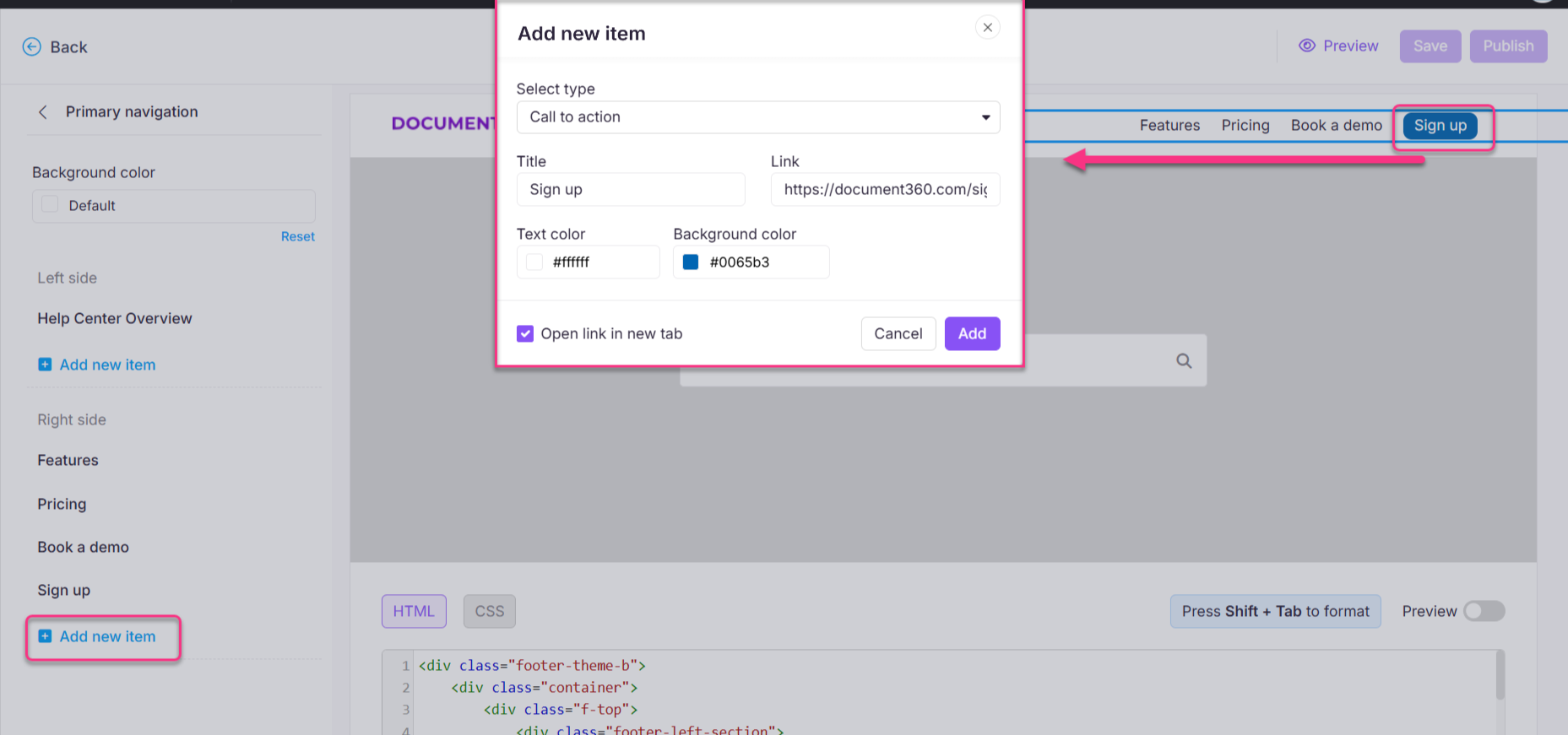
- Click Add new item to add a navigation menu to the left or right of the site header. The Add new item panel appears.
- In the Select type dropdown, choose the type of navigation item to add.
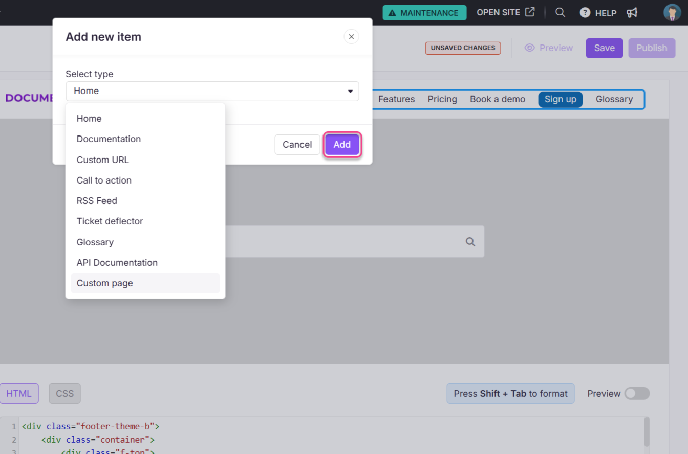
The available navigation types are:
| Type | What it adds |
|---|---|
| Home | A link to your knowledge base home page |
| Documentation | A link to your documentation page |
| Custom URL | A link to any internal or external URL |
| Call to action | A styled button with a custom label, link, and color |
| RSS feed | A link to your knowledge base RSS feed |
| Ticket deflector | An embedded support form |
| Glossary | A link to your knowledge base glossary overview page |
| API documentation | A link to your API documentation workspace |
| Custom page | A link to a custom page you've created |
You can add up to 6 items to the primary navigation. Once the limit is reached, a warning appears: "You have reached the maximum count of 6. To add a new link, remove one existing link."
- Click the default background color to open the color picker and change the navigation bar background color.
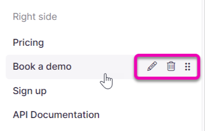
- Use the Edit (), Delete (), and Reorder () options to manage existing items from the left panel.
How to save and publish
- Use the Preview toggle on the right to review your changes.
- Click Save to save your changes.
- Click Publish to make changes live.
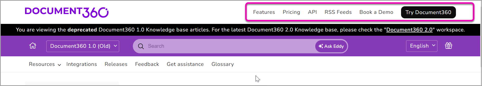
Knowledge base site view
Here is how the primary navigation appears on the knowledge base site.
Best practices
- Keep it to 4–5 items - a crowded primary navigation creates visual noise and makes it harder for readers to find what they're looking for. Prioritise the most important destinations.
- Use Call to action for one key action only - buttons stand out visually. Using more than one CTA button in the header reduces its effectiveness. Choose one primary action.
- Put the most-used links on the left - readers typically scan left to right, so place Documentation and Home on the left and secondary items like RSS or Glossary further right.
- Test navigation changes in both light and dark mode - background color choices for the navigation bar may look different across themes.
FAQ
How can I customize the header in Document360?
To customize the header beyond the built-in options, you can add custom JavaScript code in {{variable.Settings}} () > {{variable.Knowledge base site}} > Customize site > Custom CSS & JavaScript. This allows you to modify the header to include additional elements, such as links or icons.
Can I add social media icons to the header?
Yes. You can add social media icons by appending links and icons to the header navigation area using custom JavaScript. For example, you can include icons for LinkedIn, Twitter, Facebook, and Instagram.
How do I add a Call to action button to the header?
Navigate to {{variable.Settings}} () > {{variable.Knowledge base site}} > Customize site and click Customize site. Select Site header & footer, expand Header, and select Primary navigation. Click Add new item, then in the Select type dropdown choose Call to action. Enter a title and link, choose text and background colors, and click Add.
How can I dynamically create a feedback link in the header?
You can use JavaScript to create a feedback link dynamically. For example, a mailto link can be appended to the header with the current page title as the email subject, allowing readers to send feedback about a specific page directly.