The Custom CSS & JavaScript tab in the widget settings, which contains separate CSS and JavaScript sections let you extend the widget's appearance and behavior beyond the built-in styling controls. Common uses include replacing the widget icon with a custom button, programmatically controlling widget visibility, applying a dark theme, or modifying field labels and widget text.
When to use Custom CSS/JavaScript
- You want to trigger the widget from a custom button (e.g. a "Help" link in your navbar) instead of the default floating icon.
- You want to change the widget's dark theme or other visual properties not available via the built-in styling controls.
- You want to hide built-in widget controls (such as the version selector, language selector, expand icon, or drag handle) that are not relevant to your users.
- You need to automatically open the widget on page load or suppress it based on user context.
Before you begin
You must have access to widget settings in Document360 and understand basic HTML, CSS, and JavaScript.
Add Custom CSS or JavaScript
- Navigate to Connections () > Knowledge base widget.
- Hover over the desired widget and click Edit ().
- Select the Custom CSS & JavaScript tab, then use the CSS or JavaScript section as needed.
- Paste your code into the code panel.
- Click Save.
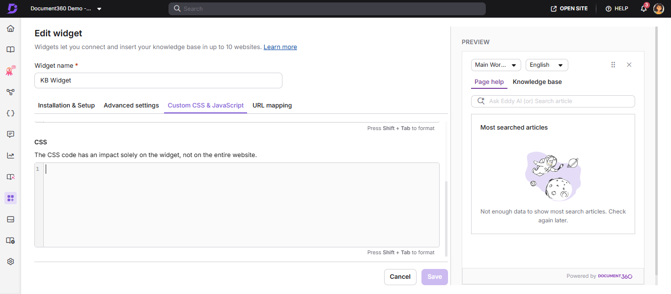
Customize Widget 2.0
Hide built-in widget controls
Use these snippets to remove individual built-in controls from the widget that you don't want to expose to your users. Add the desired snippet to the CSS section of the Custom CSS & JavaScript tab and click Save.
Hide the project version select option
Removes the version dropdown from the widget header.
#doc360-widget-modal #project-version-dropdown,
#doc360-widget-modal .version-select-sec {
    display: none !important;
}
Hide the language select option
Removes the language dropdown from the widget header.
#doc360-widget-modal #language-dropdown,
#doc360-widget-modal .language-version-select-sec {
    display: none !important;
}
Hide the "Open article in new tab" option
Removes the open-in-new-tab icon shown on an opened article.
#doc360-widget-modal .article-open-new {
    display: none !important;
}
Hide the expand/maximize option
Removes the expand icon that enlarges the widget to full screen.
#doc360-widget-modal .expand-collapse {
    display: none !important;
}
Hide the move (drag) option
Removes the drag handle that lets the widget be repositioned.
#doc360-widget-modal #move-window,
#doc360-widget-modal .move-icon {
    display: none !important;
}
Hide the entire header bar
Removes the whole top control row (version, language, move, and close).
#doc360-widget-modal .version-selection {
    display: none !important;
}
Hiding the entire header bar also removes the close (✕) button. Ensure your users have another way to dismiss the widget before applying this snippet.
Keep the Knowledge Base tab active if the widget switches to Page Help
Some implementations need the Knowledge Base tab to stay active even if the widget switches to the Page Help tab during use. This applies to Widget 2.0. If you previously handled this in Widget 1.0 by toggling CSS classes on the Page Help and Knowledge Base sections, that approach no longer works, because Widget 2.0 only loads the currently active tab's content into the page. Instead, simulate a click on the Knowledge Base tab element whenever the Page Help tab becomes active.
- Navigate to Connections > Knowledge base widget.
- Hover over the desired widget and click Edit.
- Open the Custom CSS & JavaScript tab and use the JavaScript section.
- Paste the following script and click Save.
This code is written in javascript:
(function switchToKBIfNeeded() {
    function switchToKB() {
        const kbTab = document.getElementById('knowledge-base-tab');
        const pageTab = document.getElementById('page-help-tab');
        if (!kbTab || !pageTab) return;
        if (pageTab.classList.contains('current') && !kbTab.classList.contains('current')) {
            kbTab.click();
        }
    }
    const observer = new MutationObserver(function() {
        switchToKB();
    });
    observer.observe(document.body, {
        childList: true,
        subtree: true,
        attributes: true,
        attributeFilter: ['class', 'style']
    });
    switchToKB();
})();
What this does:
Watches the widget for changes and checks whether the Page Help tab has become active.
If so, it clicks the Knowledge Base tab element to switch back, the same way a user would.
Why this works in Widget 2.0 where class-toggling does not:
Widget 2.0 controls the active tab internally and only mounts the active tab's content. Changing CSS classes directly has no lasting effect, since the app does not treat that as a real tab switch. Clicking the tab element uses the widget's own supported interaction, so it correctly triggers a real tab switch.
Customize Widget 1.0
Change the default widget icon
Replace the default floating widget icon with a custom button on your page.
Step 1: Add a custom HTML button
<button id="doc360_help_btn" class="btn hide"><span>Help!</span></button>
Step 2: Hide it by default in CSS
.hide {
    display: none;
}
Step 3: Set up callback functions in JavaScript
These callbacks control the button's visibility based on the widget's state. Add them to any of your JavaScript files or inside a <script> tag.
Show button when widget loads:
function doc360_callback() {
    document.getElementById('doc360_help_btn').classList.remove('hide');
}
Show button after being hidden by URL mapping:
function doc360_show_callback() {
    document.getElementById('doc360_help_btn').classList.remove('hide');
}
Hide button based on URL mapping:
function doc360_hide_callback() {
    document.getElementById('doc360_help_btn').classList.add('hide');
}
The show and hide callbacks are only necessary if you are hiding the widget on specific pages using URL mapping.
Step 4: Register callbacks in the widget JavaScript snippet
Modify the widget's JavaScript snippet (found in the widget settings) to include your callback functions:
<!-- Document360 Knowledge Base assistant Start -->
<script>
    (function (w,d,s,o,f,js,fjs) {
        w['JS-assistant']=o;w[o] = w[o] || function () { (w[o].q = w[o].q || []).push(arguments) };
        js = d.createElement(s), fjs = d.getElementsByTagName(s)[0];
        js.id = o; js.src = f; js.async = 1; fjs.parentNode.insertBefore(js, fjs);
    }(window, document, 'script', 'mw', 'https://cdn.document360.io/static/js/assistant.js'));
    mw('init', { apiKey: 'YOUR KEY',
                 callback: doc360_callback,
                 show_callback: doc360_show_callback,
                 hide_callback: doc360_hide_callback });
</script>
<!-- Document360 Knowledge Base assistant End -->
Step 5: Make the button open the widget
Using pure JavaScript:
document.getElementById('doc360_help_btn').addEventListener('click', function () {
    document.getElementById('document360-assistant-iframe').contentDocument.getElementById('doc360-button').click();
});
Using jQuery:
$('#doc360_help_btn').click(function() {
    $('#document360-assistant-iframe').contents().find('#doc360-button').click();
});
Step 6: Apply custom styling to the button
Apply any custom CSS to the button to match your website's branding — colors, font styles, or additional effects.
Change the dark theme
- Navigate to Connections () > Knowledge base widget.
- Hover over a widget and click () Edit.
- Open the Custom CSS & JavaScript tab, paste the snippet below into the CSS section, and click Save.
.doc360-widget-modal {
    background-color: black;
    color: white;
}

.doc360-widget-modal div,
.doc360-widget-modal li,
.doc360-widget-modal p,
.doc360-widget-modal ul,
.doc360-widget-modal span,
.doc360-widget-modal input,
.doc360-widget-modal textarea {
    color: white !important;
    background-color: black !important;
}

.doc360-widget-modal button {
    color: white !important;
}

.eddy-feedback-btn:hover {
    color: black !important;
    background-color: #e4e4e7 !important;
}

.eddy-feedback-btn {
    background-color: black !important;
}
Change field labels and text inside the widget
-
Hover over a widget and click () Edit.
-
Open the Custom CSS & JavaScript tab and paste the snippet below into the JavaScript section. Replace the text values with your own labels and click Save.
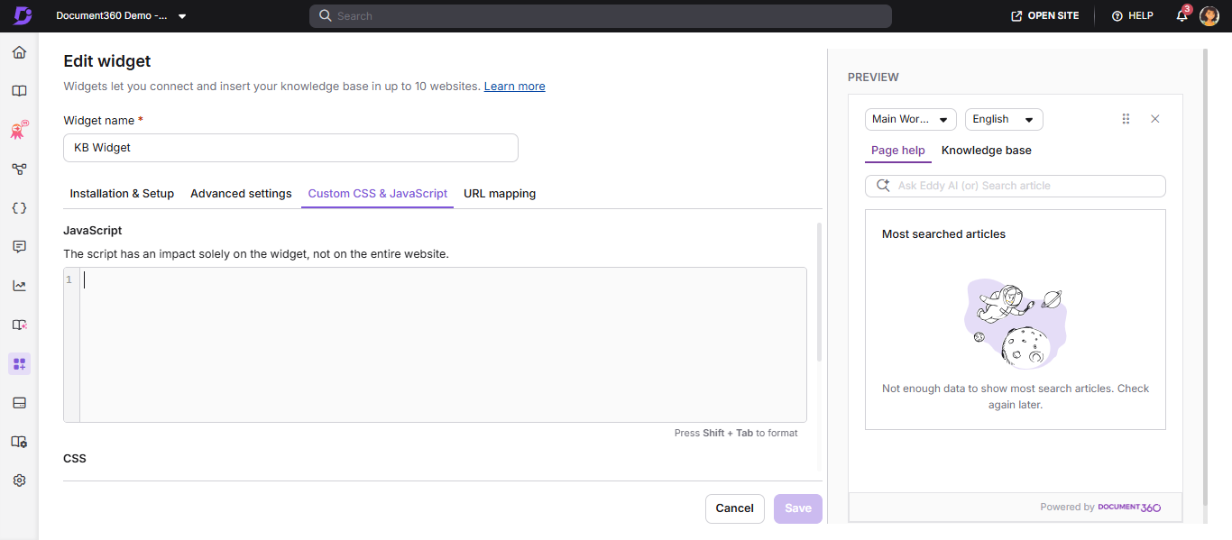
$(document).ready(function() {
    if ($('.tab-link.current').length > 0) {
        $('.tab-link.current').html($('.tab-link.current').html().replace("Page help", "Support"));
        $('.tabs li:last-child').html($('.tabs li:last-child').html().replace("Knowledge base", "Documentation"));
    }
    setTimeout(function() {
        $('#top-search-title').html($('#top-search-title').html().replace("Top search articles", "Popular Articles"));
    }, 3000);
});
$(document).ready(function() {
    $('#search-input').each(function() {
        if (!$(this).val()) { $(this).attr("placeholder", "Search..."); }
    });
    $('#category-filter').each(function() {
        if (!$(this).val()) { $(this).attr("placeholder", "Filter"); }
    });
});
Set the widget to open automatically
- Hover over a widget and click Edit ().
- Open the Custom CSS & JavaScript tab, paste the snippet below into the JavaScript section, and click Save.
$(function() {
    setTimeout(function() {
        let iframe = $('#document360-widget-iframe');
        let button = iframe.contents().find('#doc360-button');
        button.trigger("click");
    }, 2000);
});
Hide the Page help tab and Search bar for a single-article URL mapping
Paste in the CSS section of the Custom CSS & JavaScript tab:
li#page-help-tab { display: none; }
.article-header .article-back-icon { display: none; }
.search-container { display: none !Important; }
Paste in the JavaScript section of the Custom CSS & JavaScript tab:
setTimeout(function() { $('.search-container').hide(); }, 2000);
setTimeout(function() { $("#knowledge-base-tab").click(); }, 2000);
The Custom JavaScript snippet above, which clicks the Knowledge Base tab element, also works under Widget 2.0 without changes. It is listed in this section because it was originally written for single-article URL mapping, not because it is limited to Widget 1.0.
Best practices
- Always combine the Hide widget toggle (in Appearance) with a custom button to avoid showing two entry points.
- Test callback functions on both desktop and mobile before deploying.
- Scope your Custom CSS selectors specifically to widget elements to avoid conflicts with your product's existing CSS.
FAQ
Can I adjust the widget's button image size in a custom application?
No. The Document360 widget is rendered inside a cross-domain iframe, and due to browser security restrictions (Same-Origin Policy), the button image size cannot be modified from the parent application.