The Highlight element allows you to mark important areas on a step image with a colored overlay, drawing the viewer's attention to a specific region without dimming the surrounding content. Use it to emphasize UI elements, annotate key areas, or visually differentiate important sections in your interactive demos, guides, and videos.
Use cases
| Scenario | Recommended Configuration |
|---|---|
| Emphasizing a button the user needs to click | Rectangle shape, yellow or orange color |
| Marking an error field or warning area | Rectangle shape, red or custom color |
| Highlighting an icon or status indicator | Circle shape, contrasting color |
| Annotating multiple regions across a complex UI step | Multiple highlights with distinct colors and descriptive names |
| Drawing attention to a navigation item or menu option | Rectangle shape, sized to the menu entry |
Adding highlight element
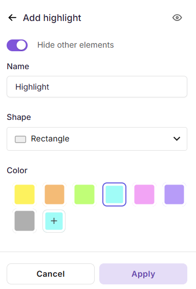
Add highlight to a step by step guide
- Navigate to the step where you want to add a highlight.
- In the right pane, go to Add elements.
- Click Highlight. If a highlight already exists, click Add new.
- Use the eye icon at the top-right to show or hide the highlight. Hidden highlights won't appear to the reader but aren't deleted.
- Enable Hide other elements to hide every other element while you configure the highlight.
- Enter a name in the Name field (e.g.,
Highlight - Save Button,Highlight - Error Field). - Under Shape, choose:
- Rectangle - for buttons, input fields, and UI regions.
- Circle - for icons, avatars, and circular components.
- Under Color, pick from the preset swatches or click + to set a custom color.
- Click Apply.
Add highlight to video / interactive demo
- In the right pane, go to Add elements.
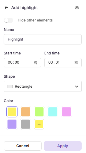
- Click Highlight. If a highlight already exists, click Add new.
- Use the eye icon at the top-right to show or hide the highlight. Hidden highlights won't appear to the reader but aren't deleted.
- Enable Hide other elements to hide every other element while you configure the highlight.
- Enter a name in the Name field (e.g.,
Highlight - Save Button,Highlight - Error Field). - Set the Start time and End time to define when the highlight appears. Use Select exact frame for precise placement.
- Under Shape, choose:
- Rectangle - for buttons, input fields, and UI regions.
- Circle - for icons, avatars, and circular components.
- Under Color, pick from the preset swatches or click + to set a custom color.
- Click Apply.
Note
Once applied, you can reposition and resize the highlight region directly on the canvas by dragging the edges.
Managing highlight elements
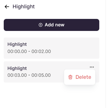
Once added, highlights appear in the Highlight panel, each showing the highlight's name and its configured time range or step number.
- Add another highlight - Click Add new at the top of the panel.
- Edit a highlight - Click any highlight in the list to edit it. Modify as needed, then click Apply to save or Cancel to go back. Use the Delete icon to remove it.
- Delete a highlight - Hover over a highlight, click the three-dot menu, and select Delete.
Best practices
- Use descriptive names - Label each highlight clearly when multiple highlights are applied across steps, to make them easier to identify and manage.
- Choose colors with intent - Yellow and orange work well for general emphasis, while custom colors can align with your brand palette or signal specific meaning (e.g., red for errors, green for success).
- Hide rather than delete - Temporarily disable highlights that are not needed instead of deleting them. This preserves the configuration for future use.
- Use Highlight alongside Spotlight - Spotlight dims the background while Highlight adds a color overlay on the target area, creating a layered emphasis effect.
- Resize and reposition on the canvas - Use the drag handles for precise placement and the rotate or fit-to-screen controls for orientation adjustments.
- Preview after applying - Confirm that the color and size render clearly against the step content and do not obscure critical information.