The Multicolumn card section lets you display content in a structured, side-by-side column layout on your knowledge base home page. Each column includes an icon, a title, and a description, giving you a visually scannable way to present multiple related pieces of information at once - without relying on long paragraphs or nested lists. This makes it particularly effective for showcasing product features, service offerings, or key documentation categories, where readers need to compare or browse options at a glance rather than read sequentially.
When to use the Multicolumn card section
- Feature highlights - Use it to display your product's key features, each with an icon, a short title, and a one-line description. Readers can quickly understand what the product offers without reading long paragraphs.
- Category navigation - Present major knowledge base sections as cards, giving readers a quick visual overview of what's available and where to go.
- About or team sections - Introduce team areas, departments, or service offerings with an icon and short description for each.
- Support tiers or contact options - Display multiple support channels (e.g. email, chat, docs) side by side with relevant icons and short descriptions.
How to add a Multicolumn card section
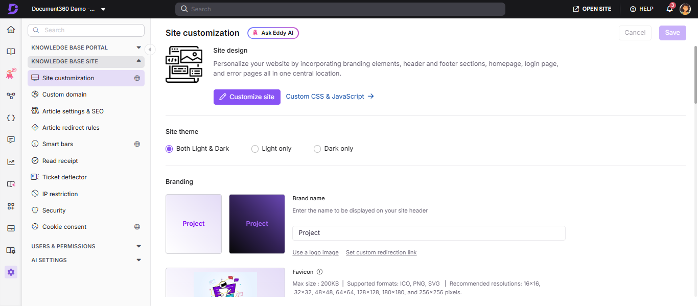
- Navigate to Settings () in the left navigation bar of the Knowledge base portal.
- In the left navigation pane, navigate to Knowledge base site > Site customization.
- Click the Customize site button.
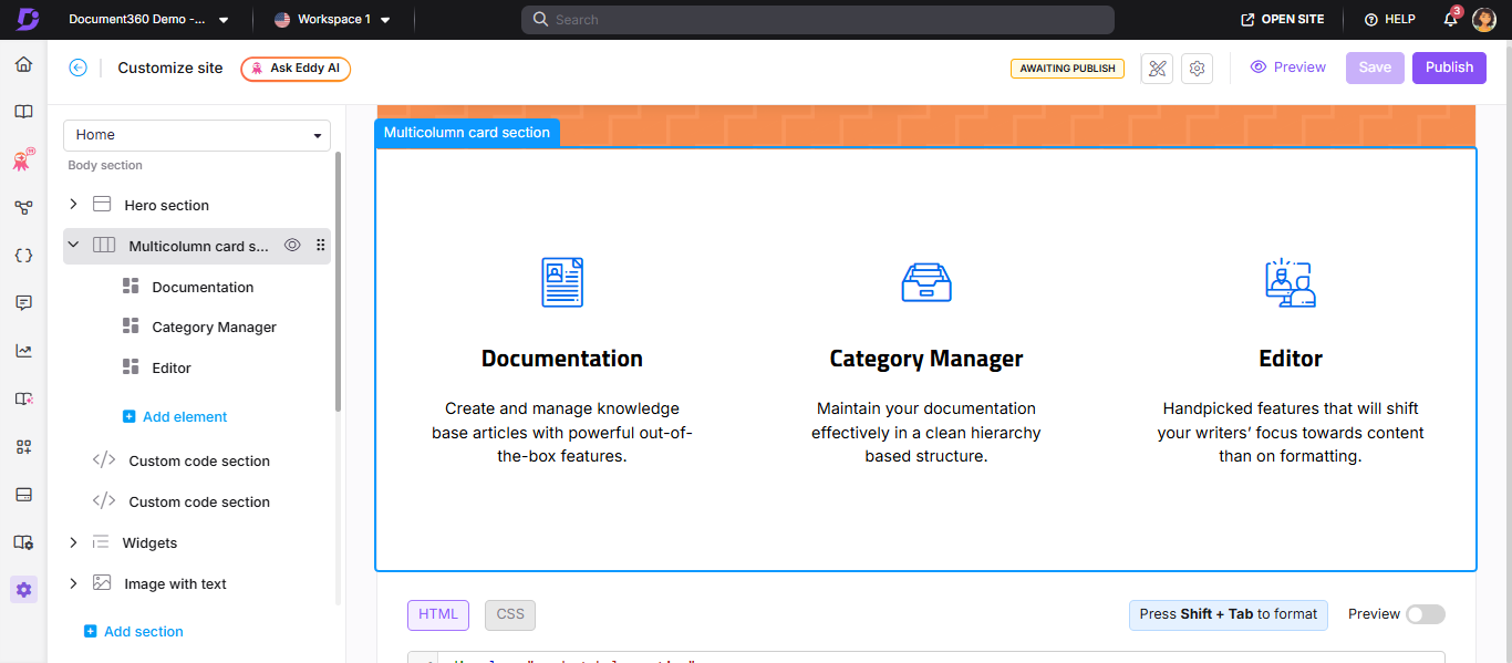
- From the left dropdown, select the Home page. The Body section displays the list of body blocks.
- Click Add section and select Multicolumn card section. The block is added with three default elements.
- Click the Multicolumn card section header to edit the section title and overall icon color.
- Click Add element to add more column elements beyond the default three.
- Use the Reorder () icon to rearrange elements within the section.
- Click the Hide () icon to toggle the visibility of individual elements.
How to configure column elements
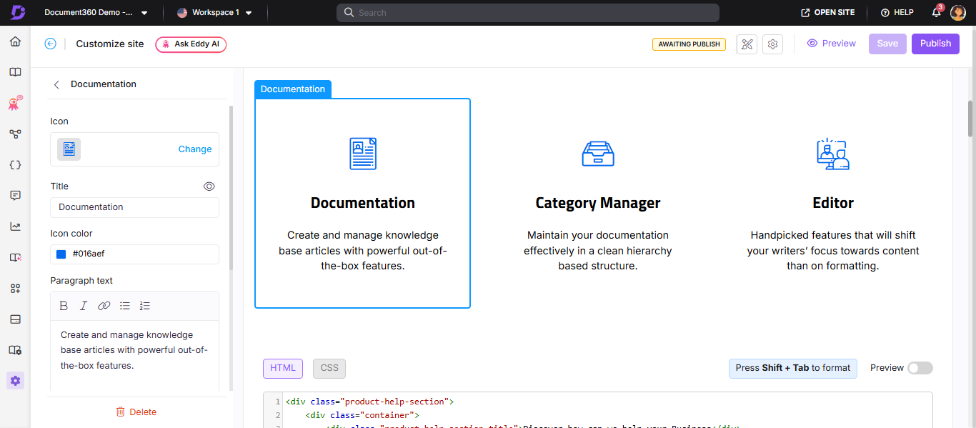
Click any element in the section to edit its attributes:
| Attribute | What you can configure |
|---|---|
| Icon | Click Change to select a Document360 or Font Awesome icon from the Icons tab, or upload/enter the URL of a custom image in the Image tab |
| Title | Enter the column title. Click the Hide () icon to hide the title without deleting it |
| Icon color | Choose a color for the icon |
| Paragraph text | Enter and format the column description using Bold (), Italic (), URL/Link (), Unordered list (), or Ordered list () |
How to save and publish
- Use the Preview toggle on the right to review your changes.
- Click Save to save your changes.
- Click Publish to make changes live.
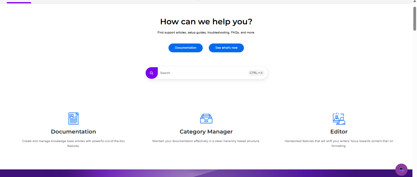
Knowledge base site view
Here is an example of a Multicolumn card section as it appears on the knowledge base site.
How to delete a Multicolumn card section
- Click the Multicolumn card section in the body blocks list. The section navigation bar appears.
- Click Delete () in the navigation bar.
- Click Yes in the Delete confirmation prompt.
- After deleting, click Save to save as a draft, Preview to review, and Publish to make changes live.
Best practices
- Keep column descriptions short - one to two sentences per column works best. Long descriptions break the visual balance of the card layout.
- Use consistent icon styles - mixing filled, outlined, and custom image icons in the same section looks inconsistent. Choose one style and stick to it.
- Use three to four columns - more than four columns on a standard screen makes each card too narrow to read comfortably.
- Match icon color to your brand - the icon color setting applies to all icons in the section, so choose a color that complements your site's brand color.
- Use square images if uploading custom icons - non-square images may appear distorted. Recommended dimensions are 30×30px or 50×50px.
FAQ
How do I update a column element's icon using Font Awesome?
Navigate to {{variable.Settings}} () > {{variable.Knowledge base site}} > Site customization and click Customize site. From the left dropdown, select the Home page. Click the desired element in the Multicolumn card section. Click Change in the icon settings. Expand the Font Awesome accordion and enter the class name of the desired icon.
For example, for the icon code <i class="fa-solid fa-files"></i>, the class name to enter is fa-solid fa-files.